


While doing some research for this piece, I was barely surprised to see that the first page of results is exclusively about e-commerce filtering. Lots of results are from Dribbble and even Pinterest… And that’s even when I write “enterprise” in my query. Have I not been using the right word? Please enlighten me. You might blame my Google algorithm, but I’m an enterprise UX designer and have been googling enterprise UX stuff for years! Luckily that’s why we’re here.
Our original Enterprise Filtering piece had a great impact, and a lot of the questions around it were about mobile use cases. Ask and you shall receive!
There’s a lot to unpack here. First off, enterprise and consumer products have very different goals. In the context of filtering, consumer filters want you to buy. They will always show you something even if there are no matches.
Whereas for enterprise filters, zero result is a valid thing to display. Or even a single result might be just the thing your user wants to see. Their goal might be to get confirmation that there are “0 items” with a “Pending” status, for example.
Enterprise and consumer apps also deal differently with labels. Consumer apps get to create labels and standardize their length.
Enterprise, on the other hand, has to deal with unpredictable user generated strings. And an unpredictable amount of strings at that.
And then they also have to prioritize their content differently. Consumer apps get to curate which filters to display and in what order —again, optimized for shopping.
While enterprise platforms have to show aaall the data points in modifiable orders. (If users reorder their table columns, ideally you’d want to reflect that in the filters as well.)
A lot of our reflection and discussion prompts for building desktop filters apply for mobile as well. Take a look here!
What are your users’ mobile use cases?
You should invest some time to research this before developing the mobile version of any enterprise feature. Enterprise tends to cater to such specific workflows, it’s very likely that the mobile version of that is even more specific.
For example, think of some kind of sales-y commerce system. Depending on their role, a user’s tasks when they’re sitting at their desk can vary greatly from what they need to update when they’re commuting between two meetings. While on-the-go they might need to be able to quickly update the status of an entry, or simply add a note.
Knowing these things about your users feeds directly into the definition of an appropriate mobile solution.
Are you building in-browser or native?
You should get familiar with your app’s environment very early. For filters, that means taking inventory of which native pieces you’ll get to reuse. Will you be leveraging browser-specific elements or OS-wide stuff?
Do you know if your users choose native Safari over the Chrome app? Are you optimizing for Android first? All of these decisions affect the visual experience of using your filters.
How will you adapt fetching?
If you’re building filters for mobile, chances are you’ve already got a filter feature running on your desktop version. But going mobile might mean you want to re-evaluate your fetching mechanism.
Something that performs well on a laptop might not work as well on a smartphone. If your desktop filters are always used with super fast wi-fi connections, how does that look on a patchy 3G network? To optimize your performance, you might want to adapt your fetching mechanism for mobile scenarios.
What makes mobile filtering so hard? Filtering is hard on mobile because with such a tiny screen, there’s a lot of scrolling. You feel disoriented and worried that you might lose your original view.
It’s also hard to know that a filter is even applied. With so little real estate on a given page, it’s hard to keep the entirety of the context in sight.
Sometimes, targets are hard to hit with sausage fingers. Of course, there are standards of usability but clearly, not everyone read the book.
And we get varying experiences whether we’re in a browser or in a native app. In-browser interactions often feel jerky because the browser UI might pop in and out of view depending on the direction you’re scrolling in. Native apps have much more control over how it feels to navigate around, but launching a brand new app is a costly team decision.
When it comes to layout and positioning, the typical options are

A top drawer that expands down
Having filters live at the top of the page is pretty expected. The eye will inevitably scan over them. It’s also natural for them to even live inside the table header row.
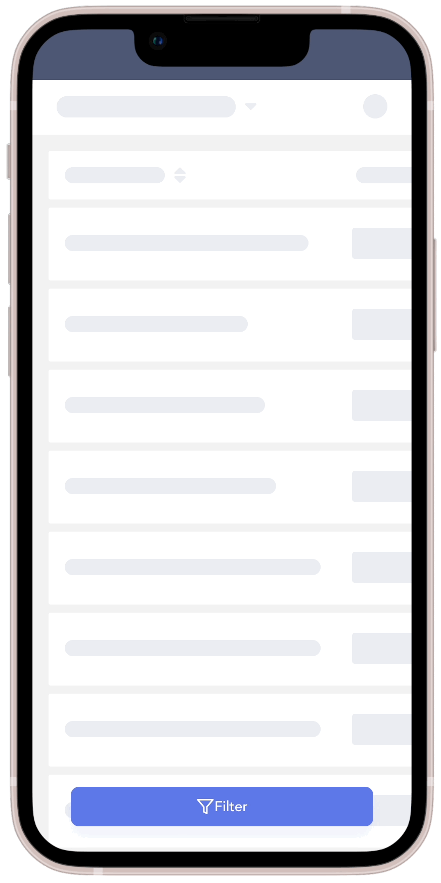
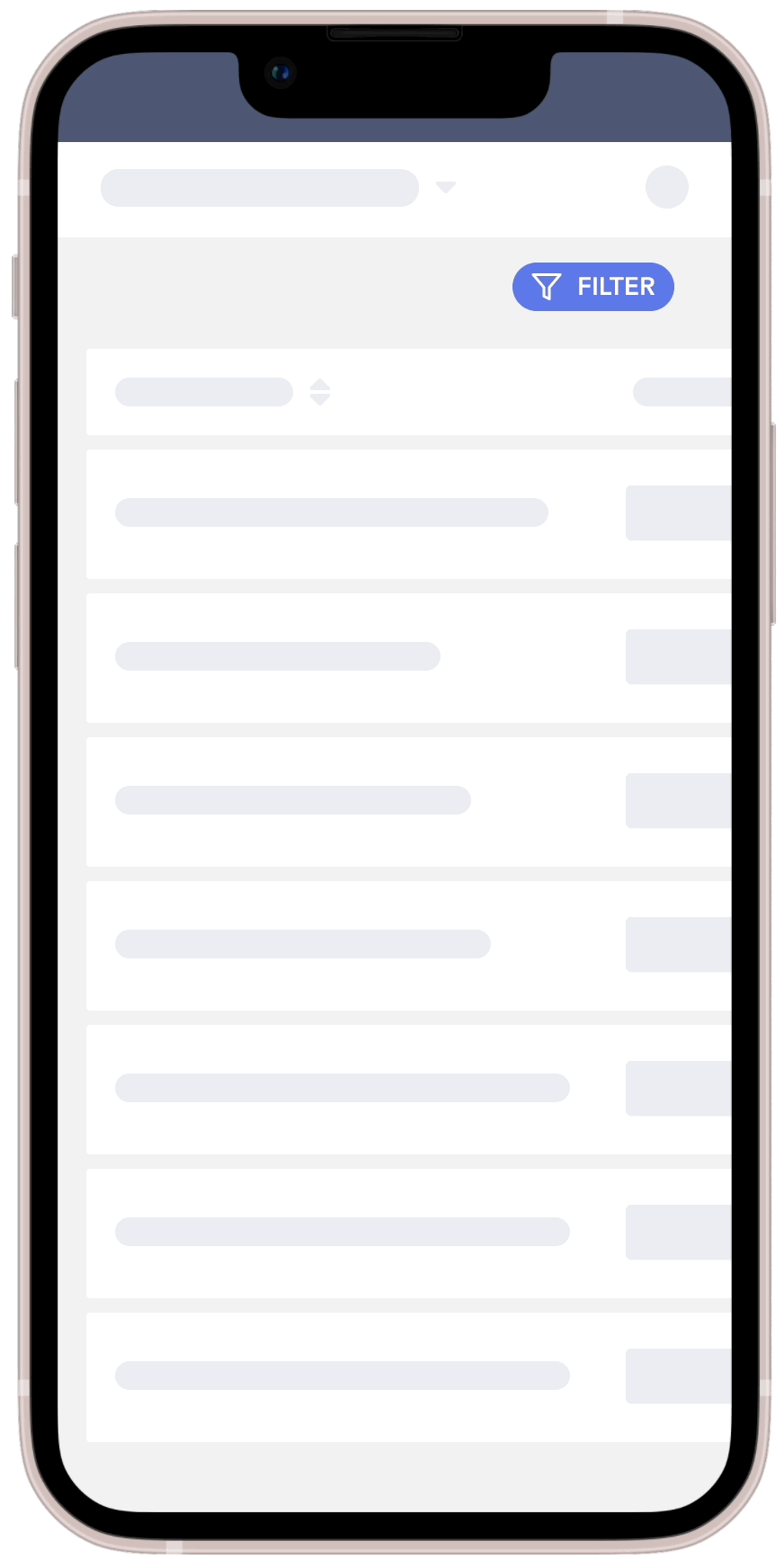
A bottom drawer that expands up
With a bottom drawer you’d have to be sure it sticks on top of the content so it’s always visible. This is precisely what will make the filter button hard to miss; it’ll overlap on top of users’ precious data and it’s easier to reach with thumbs.
A sidebar type of overlay
Having filters move-in as a sidebar provides more room to keep relevant parts of the background visible. You get to keep the left-most content visible, which is typically the most recognizable part. This helps users maintain context and feel safe that their original page isn’t lost.
And with all of those you can go two different routes:
Full-screen form type of flow
Any of these positionings can lead to a full-page filtering experience. This way to do it gives a lot of room to open and close dropdowns, navigate around all the filters, before being satisfied and clicking ‘Apply’.
The full-screen way might be more useful for use cases where the user knows exactly what they’re looking for and tends to use multiple filters at one.

Keep original page in view but grayed-out
No matter the positioning of the filters, you can also limit its size and style it in a way that it looks simply overlaid on top of the original content. Adding a subtle transparent overlay can help users recognize they’re in a temporary flow “on top” of the page.
This way can be beneficial for users who want to see the results refresh in real time so they get a sense of how the filters they choose are affecting the data.
Overall it’s important to help your users keep their bearings. Help them maintain context by still displaying a grayed-out portion of what’s underneath. Make sure to offer a quick opt-out by having the close button always visible, or by allowing them to tap the grayed-out area to click out.
The same fetching methods from our original piece apply here. Let’s look at them through the considerations of mobile behaviour.
🔴 Live-filtering means that the system pulls new results with every interaction done on the filters.
Selecting a single item from a checkbox list? Fetch. Moving a threshold slider by one pixel? Fetch. Changing your date range’s start date? Fetch.
We would typically not recommend this one because the whole screen gets refreshed at every click and you risk getting abruptly kicked out of the filter drawer.
Unless, that is, if you update in the background (keep the drawer open). This way you provide immediate feedback while preserving the user’s sense of place. But your data has to be clean so that fetching feels almost immediate.
Google went with a live filtering fetching method. As shown, results refresh as soon as any filter selection is modified.
🟡 In a per-filter scenario, refreshing happens as the dropdown gets closed. This one could work well because it requires less taps, but your performance has to be A1.
For that you’ll need to account for extra room for an “Apply” button in each dropdown. Or you can also make it so that clicking the dropdown again closes it up and triggers the refresh.
Determine what the trigger is for a multi select vs single select. For example, if you know only one value is selectable from a dropdown list, you can have it so that a single click selects the item, closes the dropdown AND triggers the refresh. Bam.
🟢 Batch-filtering is when you fetch only once, at the very end of the user selection. This option makes the most sense for enterprise products on mobile.
This gives users dedicated time to think their selection through, scan all the options and hit the Apply hard with a super refined query. Once users are done with their selection, they Apply to click out of the filter drawer and explicitly ask for results.
Again, this might not perfectly fit your users’ use cases. Batch-filtering makes it harder to be exploratory since you need to know what you’re looking for.
Here are some pattern tips & tricks to enhance mobile filtering in your enterprise product.
(Nested levels)
For enterprise contexts, you’ll want to leverage expandable sections and dropdowns. If you just expose everything right from the start, your users will get scrolling vertigo and risk feeling overwhelmed.
On the Shelter Market website, all filters are collapsible and they display the selection in real time at the top of the sidebar. (P.S. Yes I know this is an e-commerce example, gotta do what ya gotta do)
There’s going to be a lot of clicking. Which is fine on mobile, because the targets are close to each other, only a few millimeters apart. And 21st century human fingers move fast on glass screens.
As much as we encourage nesting and hiding stuff behind taps, one exception has to be for the Apply button. Users shouldn’t have to scroll to get to it. It should remain sticky, at the top or bottom, always in view.
You don’t need to display everything. If the content itself, say a table, already has a reduced number of columns displayed on your mobile version, you don’t have to reflect all the filters as well.
Limit the number of dropdowns. If a filter has 2 or 3 standardized options, check if you couldn’t instead display it as a switcher/picker.
Similarly, if a filter’s options offer numerical ranges, consider building a slider in.


.png)


Offer a “Select All” whenever you can. By offering more ways to do a selection (for example, tapping “Select All” and deselecting specific items), you increase the chances of a speedy input.
Make your selectors easy to select for fingers
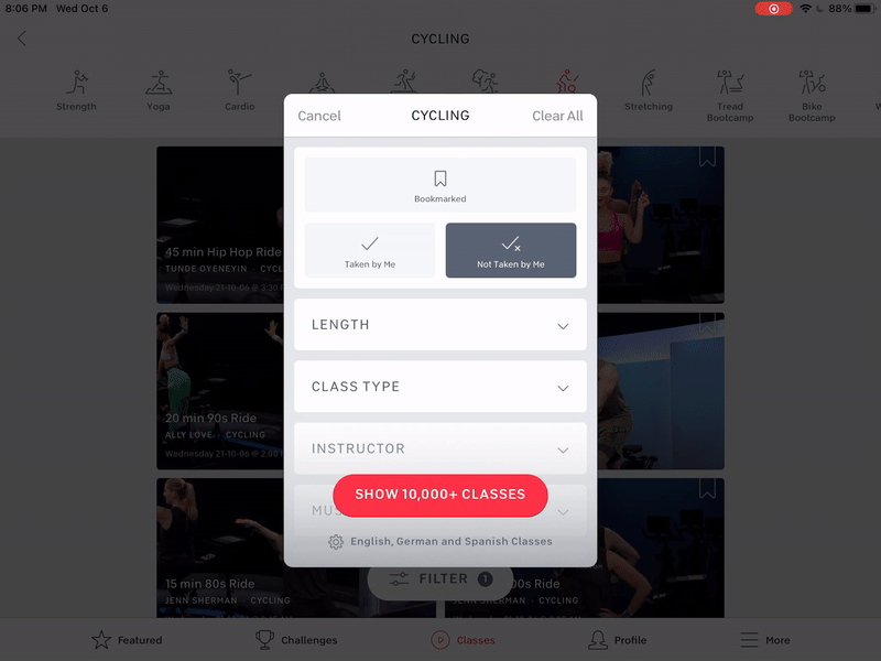
Peloton makes great use of real estate by using big button-like targets in two columns for their length options
Offer your users the ability to save their selection as a preset, so they can quickly switch in and out of their preferred views.
Especially for batch-filtering scenarios. Some power-users make filtering an art, they know exactly the way they want to see their data, the way it’s sorted and everything. Your filtering feature should honour that. Hey if it helps them in their workflow, it should make your team happy too!
Make sure the native components are used as much as possible. Not everyone knows this (shhh…) but OSes come with dropdown lists. USE THEM! Don’t try to reinvent the wheel here. Just like you wouldn’t code a whole mobile keyboard to ensure your users can input stuff. It’s wasted front-end effort and besides, it’ll likely up your performance if you don’t have to render custom dropdown overlays that respond weirdly to other stuff happening on the page.
I mean… Even Google can’t do it.
The thing about these native components is that they’re simply the best version out there. They were made by the very people who built the OS, these components are optimized to the brim. Plus, as users, they’re the ones we’ve used most often. We know how they work, they’re optimized for hand positioning and gestures. You just can’t go wrong with native.
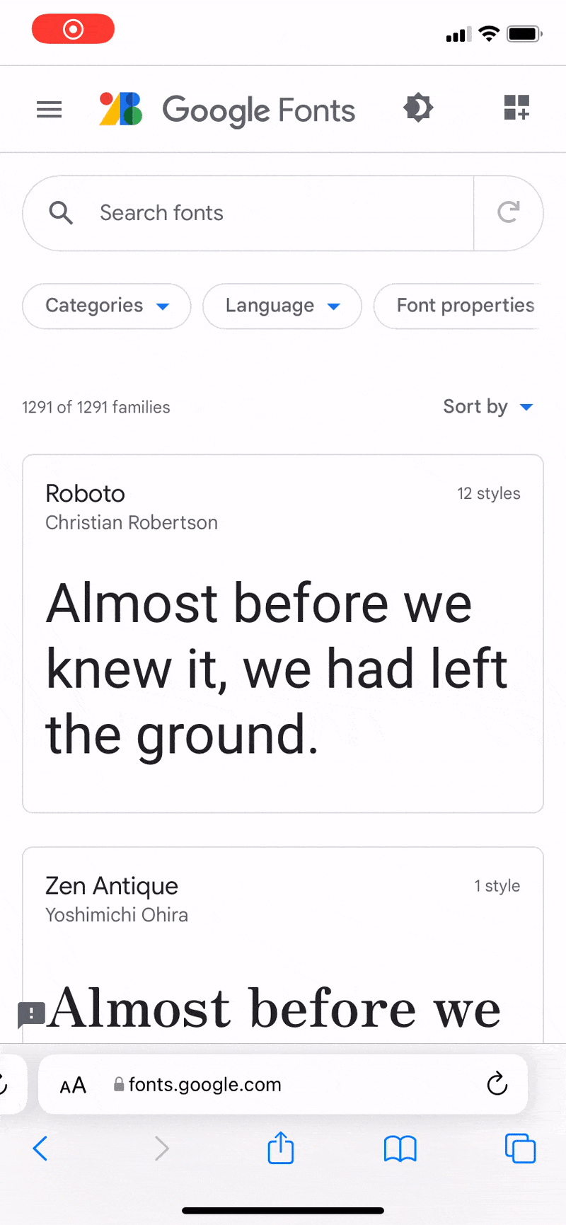
On the Google Fonts website, when those custom dropdowns are scrollable or the inputs are draggable, it quickly interferes with the browser’s scroll triggers, making for suboptimal interactions.
First off, congrats on taking on the challenge of offering your users a way to access deeper functionality on your enterprise system while on-the-go. If this made it to your roadmap, surely lots of folks will be happy.
As you design and build, make sure you find all the little places where you can provide additional help. Adapting your inputs for touch targets, revisiting the way you fetch, taking advantage of native elements in your chosen mobile environment.
As always, the better you know your users and their usecases, the more intuitive the experience will feel for them.
We hope this will help you on your journey, and we’d love to see how your mobile enterprise filters are being used in the wild!
Spend your time and life force on capturing heuristics problems rather than endless visual fiddling. Meganne Ohata will guide you the whole way, so you can propel your work and become their most trusted advisor.
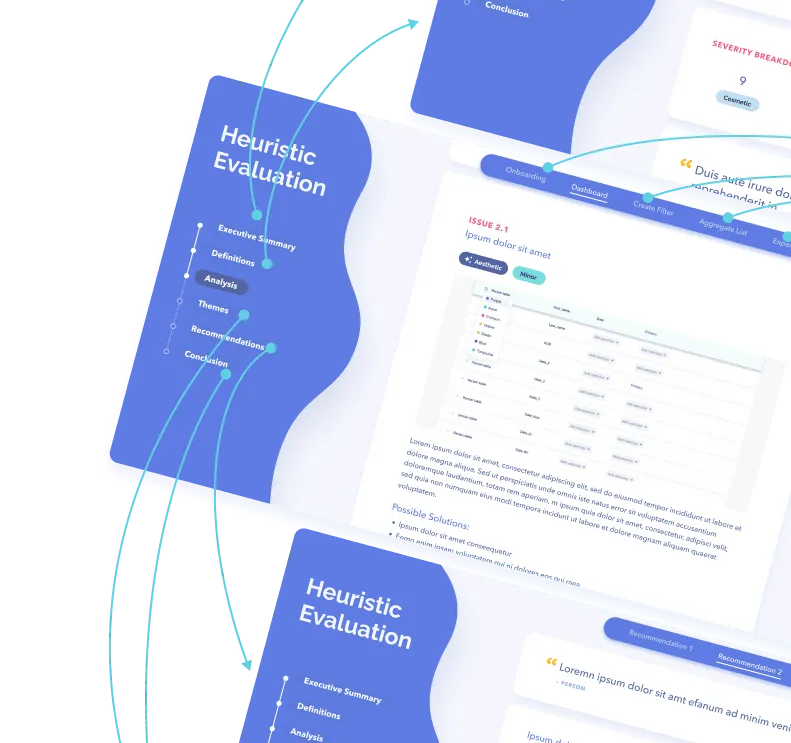
Do a mini UX audit on your table views & find your trouble spots with this free guide.

Be the first to know about our upcoming release!
.webp)

Receive an email when we publish a new article on design.


.webp)
.png)

