Visualization Challenges – The Magic Eye Poster Test
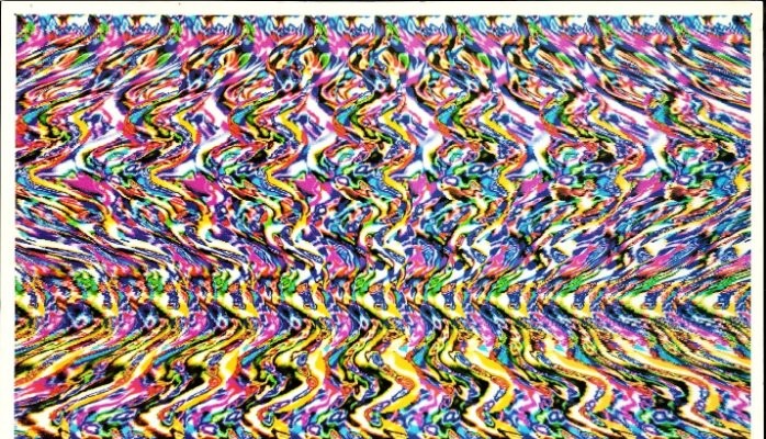
Remember the magic eye posters from the 1990s, like the one above? When you looked at them straight on, you couldn’t see the picture. But when you allowed yourself to sort of absorb all the elements, then you could see the picture that was hidden! Enterprise data platforms are similar in that they must deal with different analytical requirements from users. The traditional use case is to extract the data from the source systems on a scheduled basis, apply the business rules, and upload the transformed data into DW/OLAP systems. People use this DW as the single source of truth and build visualization for business users, to enable them to take quick actions. The IT / analytics team is always burdened with ever growing request for data, ad hoc analysis, and one-off reports. Decision makers are usually frustrated with the time taken to get their request served, usually in days. If companies want to look at recent point-of-sale transactions alongside Web site clickstreams, recent online enrolments, email campaign results, and social media chatter, for example, it would be difficult if not impossible to quickly put all that data into a relational data warehouse and look for correlations.
Things get more complicated when working with the volume, velocity, and variety attributes of enterprise data. The data volume is huge, and most of it is noise. There is a need to filter out the noise (which is usually taken care of in ETL), apply domain expertise to intelligently query the data, and extract some meaning out of the information retrieved so as to enable individuals to make sense of the data. In addition to this, there is also the matter of presenting these huge data sets in a way decision makers can readily understand and use. Here are certain factors that need to be considered while working on effective data visualization on enterprise data.
- People Investment / Knowing the Audience
Invest in educating the users who will be using the analytic solution along with investing in the enterprise data solution. Is your audience familiar with the program and its goals? If not, fix it! Bubble charts, for example, express multiple data features in a single icon. The size of the bubble, its color, and its coordinates can be leveraged to communicate, but your audience needs to know what those combinations mean.
- Understanding the data
In order to create an effective visualization of data, it is very important to understand the data in detail: its context, its meaning, and how it helps the end users. Only true domain expertise can overcome this challenge.
- Visualization selection
Selecting the right kind of visualization that the human eye and brain can easily comprehend is very important. This is the reason why some graph types are strongly favored for displaying certain data types, e.g., bar graphs to compare values, line graphs to show change over time, scatter plots to show relationships between values, pie charts to show composition of a whole, etc. In addition to this, the right placement of the visualization on the screen also plays an important role. The four books of Edward Tufte remain classics of data visualization.
- Fast response time
There is always a challenge of going through voluminous data at high speed in order to find the relevant information. The challenge further increases if the data is very fine-grained. Organizations are switching to powerful hardware, increased memory, and parallel processing in order to accomplish this. Another way is getting the data in memory but using a distributed computing approach, where many machines are used to solve the problem. Architectures like LAMBDA or KAPPA can be used to handle low latency ad hoc queries or real time data.
- Tool selection
With many tools available in the market, selecting the right tool is important. The choice should be made considering both the use case requirements and the available expertise in the organization. People tend to favor tools that can serve as the complete analytic platform – combining data integration, data management, and business intelligence products, pre-certified to run together – for a more effective way to harness huge data volumes.
- Integration
Integration with enterprise systems is also another challenge. A best practice is to expose the solution as web services or REST APIs so that it can be integrated with other enterprise systems and applications.
Type of Analytics and Tools
Visualization of enterprise data in raw form is not an efficient strategy due to its large volume. We list below some common use cases along with appropriate tool and technologies solving those use cases.
It has been said that a picture is worth a thousand words. In this age of “big data”, whether it be from the enterprise or from the Internet of Things, data visualization plays a pivotal role in transforming the avalanche of data into actionable insights, that is to say into a clear picture of what needs to be done. From creating a representation of data points to report on progress, to representing concepts for customer segments, to conducting ‘what-if’ analyses, data visualization is an invaluable tool in a variety of settings.
This article concludes the series discussing the role of data and analytics in the modern digital enterprise. Previous posts of this series have covered the readiness of the Enterprise Data Platform for digital transformation, mechanisms and tools for ingesting various kinds of enterprise data, the data processing options and capabilities including data lakes, how enterprise platforms have different shapes and flavors to store data, the importance of data quality, and converting digital data to SMART analytics. Thanks to my co-authors Sunil Agrawal, Sanchet Dighe, Shirish Joshi, Mataprasad Agrawal, Deepa Deshpande, and (for this final article) Jolly Varghese. We hope that this series has been worthwhile for you. A combined and more comprehensive version of these materials will be available soon as a white paper from Persistent Systems.
Dr. Siddhartha Chatterjee is Chief Technology Officer at Persistent Systems. Jolly Varghese is an Architect at Persistent Systems.
Two decade experience in software development, performance engineering and embedded system engineering.
8yConsidering popularity of R , there is a great tool called Shiny from Rstudio, which does the visualization part. Thought of sharing