Most Frequent AE by Relative Risk/Forest Plot using R
Jagadish K.
Experienced SAS/R Programmer | 11 Years into SDTM, ADaM, TFLs, Oncology, Infectious Diseases & Other Therapeutic Areas
The purpose of this article is to work on the steps to develop the plot of "Most Frequent AE by Relative Risk" using R programming.
The first thing we need is the ADAE data. We can download the sample ADSL and ADAE datasets from the below github path
Step 1: Copy the ADSL and ADAE into the local disk. Before that install the tidyverse package. Then load the datasets into R environment using the load function/verb. We will be using the tidyverse to do all the data manipulation. We also need to call the libraries tidyverse/tidyr to perform the data manipulations.
install.packages('tidyverse')
library(tidyr)
library(tidyverse)
load(file = "C:/Users/user/Documents/adae.rda")
load(file = "C:/Users/user/Documents/adsl.rda")
Step 2: Subset the population dataset ADSL on SAFFL safety flag and lets consider only two treatments for comparison. Since R is case sensitive, we will convert all the upcase variables in ADSL and ADAE to lower case.
adsl2  <- adsl %>% rename_with(tolower) %>%
filter(saffl=='Y' & trt01a==c('Xan_Hi','Pbo')) %>%         select(usubjid,saffl,trt01a)

adae2  <- adae %>% rename_with(tolower)
Step 3: Get the bign count of the subject in both the treatments and transpose the datasets
adsl_cnt2 <- adsl2 %>% group_by(trt01a) %>% summarise(bign=n()) %>%
              pivot_wider(names_from = trt01a, values_from = bign)

Step 4: Using the above dataset, create separate variables/macro variable to store those values two treatment counts
pbo <- adsl_cnt2$Pb
xan <- adsl_cnt2$Xan_Hi
Step 5: Merge the ADSL and ADAE on usubjid variable, keep only the required variables and remove the duplicate records, group by treatment and aedecod. Get the count of each aedecod per treatment and then derive the percentage. While deriving the population we are using the macro variables pbo and xan which has the population bign count.
adsl_adae = inner_join(adsl2,adae2,by=c("usubjid")) %>%
  select(usubjid,aedecod,trt01a.x)  %>% distinct(usubjid,aedecod,trt01a.x) %>%
  group_by(trt01a.x,aedecod) %>%
  summarise(cnt=n(),.groups = 'drop') %>% ungroup() %>%
  mutate(pct=ifelse(trt01a.x=='Pbo',cnt/pbo,cnt/xan)) %>% ungroup() %>% arrange(aedecod,trt01a.x)
After the merge we get the below dataset. Please note that the trt01an variable gets automatically renamed as trt01an.x after the merge.

Step 6: Derive the mean relative risk, lcl and ucl following the below formula for the relative risk plot. Subset only that data where the mean is not NA.
adsl_adae2 <- adsl_adae %>% select(-pct) %>% pivot_wider(names_from = c(trt01a.x), values_from = cnt) %>%
  mutate(nb=Pbo, na=Xan_Hi, snb=pbo, sna=xan, a=na/sna, b=nb/snb,factor=1.96*sqrt(a*(1-a)/sna + b*(1-b)/snb),
         lcl=a-b-factor,ucl=a-b+factor,mean=0.5*(lcl+ucl)) %>% filter(!is.na(mean))

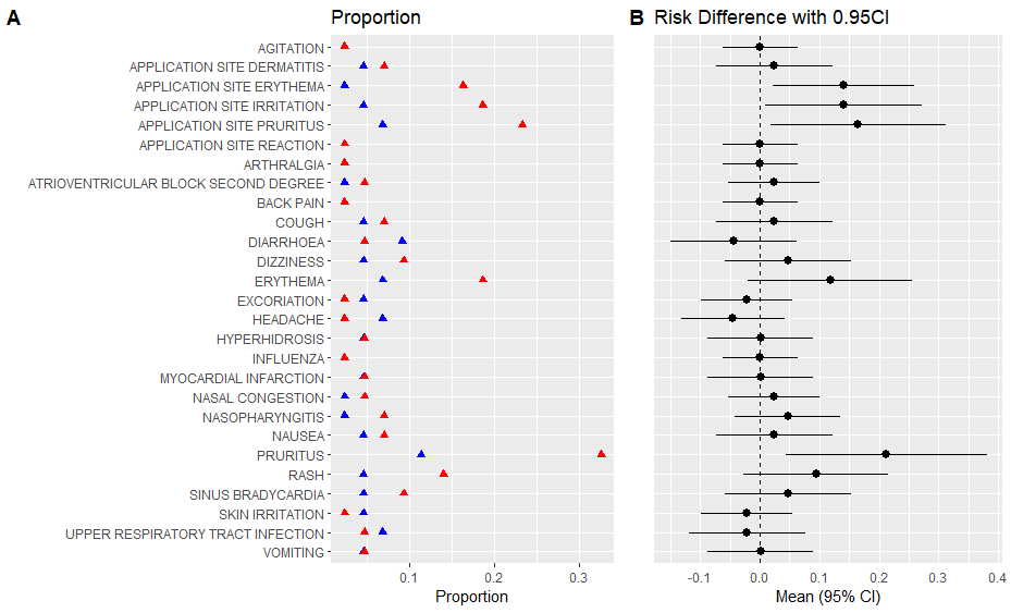
Step 7: Plot 1: AE Proportion dot plot
ggplot(adsl_adae %>% filter(aedecod %in% adsl_adae2$aedecod) %>%
         arrange(desc(aedecod)),aes(x=pct,y=reorder(aedecod,desc(aedecod)))) +
  geom_point(shape = 17,size=2,aes(colour = factor(trt01a.x))) +
  ggtitle("Proportion") +
  xlab('Proportion') + ylab('') +
  scale_colour_manual(values = c("Blue", "Red")) +
  theme(legend.position="bottom") + labs(col="Treatment:")

Step 8: Plot 2: Relative Risk
ggplot(data=adsl_adae2, aes(x=reorder(aedecod,desc(aedecod)), y=mean, ymin=lcl, ymax=ucl))
  geom_pointrange() +
  geom_hline(yintercept=0, lty=2) +  # add a dotted line at x=1 after flip
  coord_flip() +  # flip coordinates (puts labels on y axis)
  xlab("") + ylab("Mean (95% CI)") +
  ggtitle("Risk Difference with 0.95CI")+

Step 9: To align the above two images side by side, use the package cowplot.
install.packages('cowplot')
library(cowplot)
Save the two graphs in separate vectors as p1 and p2.
p2 <- ggplot(data=adsl_adae2, aes(x=reorder(aedecod,desc(aedecod)), y=mean, ymin=lcl, ymax=ucl)) +
  geom_pointrange() +
  geom_hline(yintercept=0, lty=2) +  # add a dotted line at x=1 after flip
  coord_flip() +  # flip coordinates (puts labels on y axis)
  xlab("") + ylab("Mean (95% CI)") +
  ggtitle("Risk Difference with 0.95CI") +
  theme(axis.text.y = element_blank(),axis.ticks = element_blank(),legend.position="none")


p1 <- ggplot(adsl_adae %>% filter(aedecod %in% adsl_adae2$aedecod) %>%
         arrange(desc(aedecod)),aes(x=pct,y=reorder(aedecod,desc(aedecod)))) +
  geom_point(shape = 17,size=2,aes(colour = factor(trt01a.x))) +
  ggtitle("Proportion") +
  xlab('Proportion') + ylab('') +
  scale_colour_manual(values = c("Blue", "Red")) +
  theme(legend.position="bottom") + labs(col="Treatment:")
Step 10: Use the plot_grid to align the two plots
plot_grid(p1, p2, labels = "AUTO",nrow = 1,rel_widths = c(0.8, 0.5))

However, in the above graph, I could not place the legend in the above graph, if I try then the alignment between the two plots will be lost.

If anyone has any thoughts on how to place the legend but still align the two plots, please share.
P.S. The opinions and views expressed here are mine and not of anyone else's.
Senior Automation Engineer at Veramed
3dHi Jagadish, many thanks for putting this article together, it certainly helped me in understanding how to create this plot which is similar to one of the FDA Safety Tables (Figure 4). In order to get the layout that you require you can use the ‘gridExtra’ package to layout items vertically as well as horizontally. All you need to do is extract the Legend from the first plot and then add it beneath the other two plots. An example of this can be found on the following tutorial: https://www.youtube.com/watch?v=jR6Qm4L6wpA
--
2yThank You Jagadish for Very informative and detailed Explanation. Very useful for R Learners..
Statistical Programming Lead at the Janssen Pharmaceutical Companies of Johnson & Johnson
2yThank you Jagadish. It was very useful and informative. 😀
CTIO, Prudential Health India
2yGood stuff Jagadish K.
Manager, Statistical Programming at IQVIA
2yI was looking for this actually, thanks for sharing!