Data Modelling In Power BI (Sankey Diagram Example)
Muhammad Javed
Technical Manager | Software Design Expert | Data Driven Insights | Data Science Practitioner
Data modeling, the art of organizing and structuring data, is the backbone of any successful analytics project. And with Power BI, the possibilities are endless.
Data modeling in Power BI is like a well-choreographed dance between data and visualization. It organizes data, making it sing and dance on your reports. It's the art of sculpting raw data into a cohesive and structured masterpiece.
And what better way to showcase this masterpiece than with a Sankey Diagram?
Ah, the Sankey Diagram, a master illusionist of sorts. Its elegant curves and interconnected flows effortlessly capture the intricate nature of data relationships. The graceful flow of data from one table to another creates a captivating showcase of valuable insights.
In this example, we'll explore Sankey diagrams and how they can bring your data to life.
Prepare to be amazed as we unravel the secrets of data visualization, one node at a time.
First…
What Is Data Modelling in Power BI?
Data modeling in Power BI is structuring and organizing raw data into a coherent framework. It involves defining relationships, hierarchies, and calculations to enable meaningful analysis. This process enhances data's usefulness, enabling you to extract valuable insights and make informed decisions.
Data modeling empowers Power BI to transform complex data into interactive, insightful visualizations, driving effective business intelligence.
Why Do We Use Data Modelling in Power BI?
It's not just about making data look neat. It's about ensuring data is structured, organized, and optimized for efficient analysis and decision-making. Data modeling in Power BI is essential for several reasons:
Structure: Raw data often comes in unorganized, scattered forms. Data modeling organizes it into a structured layout, making it understandable and facilitating analysis.
Efficiency: By establishing relationships, hierarchies, and calculations, data modeling enables efficient data exploration. This streamlines the analysis process and accelerates decision-making.
Accurate insights: Data modeling accurately defines calculations, measures, and aggregations. This leads to trustworthy insights and decision-making, as you can rely on the integrity of the data.
Data consistency: Enforcing referential integrity and data validation rules within the model maintains data consistency. Moreover, it prevents discrepancies that could arise from incorrect or incomplete data.
Enhanced visualization: Meaningful visualizations depend on structured data. A robust data model provides a clear context for creating compelling charts, graphs, and dashboards to communicate insights effectively.
Performance optimization: Data modeling optimizes query performance. Structuring the data reduces processing time and ensures quick response when generating visualizations or performing analyses.
Scalability: Businesses constantly accumulate more data. A well-structured data model is scalable, accommodating additional data sources and handling increased data volumes without sacrificing performance.
Data quality: Data modeling allows for data cleansing and transformation before it enters the model. This ensures the data used for analysis is accurate, consistent, and relevant.
Complex analysis: Data modeling supports advanced calculations and measures. It enables complex analysis involving time intelligence, forecasting, or custom business logic. Consequently, it empowers you to perform intricate analytical tasks with ease.
Best Practices for Creating Efficient Data Modeling in Power BI
Creating efficient data modeling in Power BI is essential for delivering accurate insights and optimal performance. Following best practices ensures your data model is well-structured and facilitates effective analysis.
Understand your data: Before creating a data model, thoroughly comprehend your data sources, their relationships, and business context. This understanding guides you in designing a model that accurately represents your organization's data landscape.
Simplicity and clarity: Avoid unnecessary complexity hindering performance and confusing users. A straightforward model is easier to manage and interpret.
Normalization: Apply database normalization principles to eliminate data redundancy and improve data integrity. Divide data into tables based on their logical relationships, reducing duplication and maintaining consistency.
Establish relationships: Define relationships between tables based on common fields. Establishing relationships allows for seamless data navigation and table aggregation, enhancing analysis accuracy.
Avoid circular references: Circular references can lead to confusion and performance issues. Plan your data model structure to avoid loops in relationships, as they can negatively impact calculations and navigation.
Use hierarchies: Hierarchies provide an intuitive way to navigate and drill down into data. Use hierarchies to allow users to explore data at varying granularity levels, such as date, product, or geography.
Regular maintenance: Regularly review and optimize your data model. Adjust to accommodate changes while maintaining efficiency as data sources and business needs evolve.
Testing and validation: Thoroughly test your data model to ensure accurate calculations and relationships function as intended. Validate the model's output against known benchmarks to guarantee reliability.
Example of Data Modeling in Power BI with Sankey Diagram
Let’s divide the data modeling process into five stages for a better understanding.
Stage 1: Logging in to Power BI
Log in to Power BI.
Enter your email address and click the “Submit” button.

You are redirected to your Microsoft account.
Enter your password and click “Sign in“.

You can choose whether to stay signed in.

Once done, the Power BI home screen will open.
Stage 2: Creating a Data Set and Selecting the Data Set to Use in Your Sankey Chart
Go to the left-side menu and click the “Create” button.
Select “Paste or manually enter data“.

We’ll use the following cash flow data for this example.

Paste the above data table in the Power Query Window.
Select the “Create a dataset only” option.

On the left-side menu, click “Data Hub“.
Power BI populates the data set list. (If you have not created a data set, refer to the Error! Reference source not found section).

Choose a data set for the Sankey chart.
PBI populates the screen as shown below:

Click on the “Create a report” dropdown.
Select “Start from scratch“.

A Report Canvas screen appears as below:

Stage 3: Adding the Power BI Sankey Diagram Extension by ChartExpo
Creating the Sankey Diagram requires us to use an add-in or Power BI visual from AppSource.
Navigate to the right side of the Power BI dashboard.
Open the Power BI Visualizations panel.
Click the ellipsis symbol (…) as highlighted in the diagram below. This will import the Power BI Sankey Diagram extension by ChartExpo.

The following menu opens:
Select the “Get more visuals” option.

The following window opens.
Enter “Sankey Diagram for Power BI by ChartExpo” in the highlighted search box.
You should see the “Sankey Diagram for Power BI by ChartExpo”, as shown in the image below.

Click the highlighted “Add” button.

Power BI will add the “Sankey Diagram for Power BI by ChartExpo” in the visualization panel.

Stage 4: Drawing a Sankey Diagram with ChartExpo’s Power BI extension
Select the “Sankey Diagram for Power BI by ChartExpo” icon in the visualization panel.
The following window opens in the report section of your dashboard:

You can resize the visual as needed.
Navigate to the right side of your Power BI dashboard.
You should see “Fields” next to “Visualizations“.

You’ll select the fields to use in your Sankey chart here.
The ChartExpo visual needs to be selected, though. Select the field in the following sequence:
● Total Cost
● Company Type
● Company Name
● Expertise Categories
● Expertise
● Cost

You’ll be asked for a ChartExpo license key or email address.

Stage 5: Activate your ChartExpo Trial or Apply a Subscription Key
● Select the ChartExpo visual.
● You should see three icons below “Build Visual” in the Visualizations panel.

● Select the middle icon, “Format visual“. The visual properties will be populated as shown below.

● To begin using ChartExpo as a new user;
1. Enter your email address in the textbox under the “Trial Mode” section. ChartExpo will send the License key to this email upon subscribing to the add-in.
2. Ensure you provide an accurate and up-to-date email address.
3. Toggle “Enable Trial” to activate your 7-day trial.

4. You should receive a welcome email from ChartExpo.
5. If you do not find the email in your inbox, kindly check your spam folder.
6. The Sankey Diagram you create under the 7-day trial contains the ChartExpo watermark.

● If you have obtained a license key:
1. Enter your license key in the “ChartExpo License Key” textbox in the “License Settings” section (see below).
2. Slide the toggle switch next to “Enable License” to “On“.

3. Your Sankey Diagram will then appear without a watermark.

4. Let's add the Prefix (e.g., $ sign) to the chart's numeric values.
5. Expand the "Stats" properties. Add the Prefix value (e.g., $ sign).

6. Let’s add colors to each node. Expand the “Level Colors” properties and select the colors.

7. Automatically all changes will be saved.

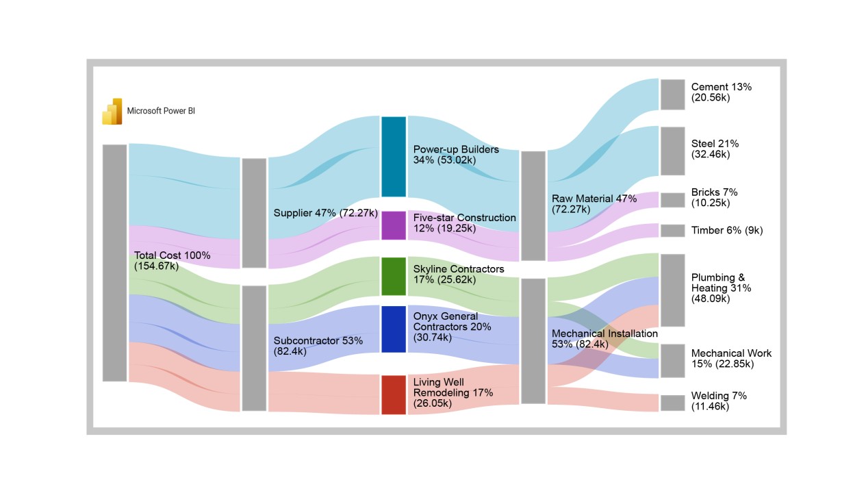
Insights
● At level 1, procurement cost totals $155K.
● At Level 2, the supplier received $72.3K (46.7%) of the overall cost, while subcontractors received $82.4K (53.3%).
● At Level 3, the supplier cost was split between Power-up Builder ($53.0K) and Five-star Construction ($19.3K).
● The subcontractor cost was divided among Skyline Contractors ($25.6K), Onyx General Contractors ($30.7K), and Living Well Remodeling ($26.0K).
● At Level 4, supplier companies provided raw materials worth $72.3K, with Mechanical Installations accounting for approximately $82.4K.
● The raw material cost of cement, steel, bricks, and timber amounted to $20.6K, $32.5K, $10.3K, and $9K, respectively.
● From the mechanical installation cost, Plumbing Heating, Mechanical Work, and Welding contributed $48.1K, $22.9K, and $11.5K, respectively.
FAQs
What are the key components of Data Modeling in Power BI?
Key data modeling components in Power BI include tables, relationships, calculated columns, measures, hierarchies, and data types. These elements collectively structure, transform, and enhance raw data, enabling effective analysis and visualization for informed decision-making.
Why is data modeling important in Power BI?
Data modeling is crucial in Power BI as it structures raw data, establishes relationships, and defines calculations. This organization enhances analysis, enables accurate insights, and creates efficient visualizations, laying the foundation for informed business decisions.
What is the difference between data modeling and data visualization?
Data modeling involves structuring and organizing raw data into a coherent framework with relationships and calculations. Conversely, data visualization focuses on presenting data in graphical or interactive formats to convey insights and patterns.
Wrap Up
Through meticulous structuring, relationships, and calculations, data modeling with Power BI transforms raw data into a cohesive narrative. The power of accurate insights lies within this organized framework, fostering a solid foundation for analysis.
Data modeling serves as the compass, guiding us toward actionable insights through the labyrinth of numbers. It ensures data integrity, optimizes performance, and amplifies the clarity of visualizations.
The striking Sankey Diagram, an exemplar of data modeling's potential, exemplifies this prowess. It breathes life into data pathways with its flowing arcs and interconnected nodes. Consequently, it reveals patterns and flows that might otherwise remain hidden.
It's more than a visualization. It's a storytelling tool that can unearth supply chain dynamics, budget allocations, energy usage patterns, and much more.
Conclusively, the Power BI data model bridges the gap between raw data and actionable insights. Consequently, it propels organizations towards more informed, efficient, and strategic decision-making.
Do not hesitate.
Combine ChartExpo's cutting-edge visualization capabilities with Power BI's analytics muscle. Witness the magic of insightful, interactive data representations that inspire action.