Can you create a Brand as Iconic as the Playboy Bunny?
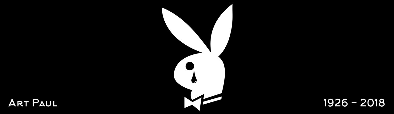
We recently heard the sad news that Art Paul, the creator of the world-famous Playboy logo had passed away aged 93.
Paul was a freelance illustrator when he started working with Playboy founder Hugh Hefner as the magazine’s first employee back in the 1950’s. Rumour has it that the iconic rabbit-head logo, with cocked ear and tuxedo bow tie was sketched by Paul in just half an hour.
That very logo has appeared on the front cover of every issue of the Playboy magazine ever since...
But the logo doesn’t appear where you think it might, you may not even see it at first glance but it’s always there. It’s become an ongoing joke amongst the Playboy staff to hide the logo somewhere on the cover of each magazine and this tradition has stuck with them throughout the years. Much like the logo, which to this day remains completely unchanged and unaltered from its original design. It has become the figure-head of Playboy’s corporate identity and has since been used across all its merchandising as the brand has grown.
The Playboy logo is arguably one of the most iconic logos in the world.
It is said that Playboy makes more money from licensing its logo than it does from selling its magazines....
That’s a pretty powerful thing. But in a world where companies are changing their brands and updating their visual identities all the time, how is it that this simple drawing, that took just 30 minutes to create, has managed to stand the test of time?
Recognisable across the world, the solid black Playboy logo portrays an image of luxury, class and some mystique. Surprising considering what Playboy has come to represent for many of us! Playboy has resisted the urge to update the logo or add vibrant colours. It’s become a classic logo with a great history. So how do you go about creating a logo that is simple yet powerful enough to last a lifetime and beyond?
The use of the solid black keeps the logo timeless and classic. As we know, black never goes out of style and it’s a strong and powerful colour. The use of an image, the bunny which perhaps represents the mischievous character, providing a certain cheekiness about it. These days many logos incorporate the name of the brand, rather than being an image or symbol as such.
There are very few logos that will stick around for as long as the Playboy bunny has done. Apple and Nike come close. The apple and the Nike tick brands again have remained relatively unchanged since their inception and like the Playboy symbol, are instantly recognisable more importantly, memorable, by pretty much everyone across the world. McDonalds and the London Underground logos are other good examples.
There is no doubt, that Art Paul left his 'mark' (apologies) but, as the great man once said:
“You can do pretty nice things in half an hour,”
Nick Street
We.Are.Fred.
www.wearefred.co.uk
British freelance writer travel,health and beauty. Content writer.0034 608714709
5yAn interesting article with some very useful information about branding Nick Street.