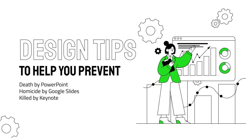
Avoid Death by PPT (or Homicide by Google Slides) with 3 EASY Slide Design Tips
Dr. Sarah Glova
Researching the science of achievement—to help people and organizations do BIG things. Let's unlock some potential 💪
I work with students on presentation skills, and I've been looking for a quick article or video that summarizes best practices for clean slide design. I couldn't find a resource that was recent and concise—so I decided to make one myself!
I created "Avoid Death by PPT (or Homicide by Google Slides) with 3 EASY Slide Design Tips" and figured I'd share it because, honestly, these are design tips that I use to this day in my presentations, so they aren't just for students. If you can improve your presentation skills by improving your slide design—hey, that's the kind of skill that will get you noticed, promoted, funded, etc. So let's dive in.
Why we're here - Death by PowerPoint" (or Homicide by Google Slides... or Killed by Keynote.)
You know what it feels like to be sitting in a boring presentation, one with overwhelming or confusing slides. It's the worst feeling! And I talk about it with my students, but let's be honest—we see these kinds of presentations all the time, from the classroom to the C-Suite.
And often, the boredom comes from the slides. I'm focusing on slides today because I have three easy tips that can help you improve your slides.
These tips can work for everyone - you don't have to be a graphic designer!
- They're easy. They're simple tips that help your audience to remember more of the information that you share and pay attention to more of the information that you say.
- They're tech agnostic. PPT, Google Slides, Keynote, doesn't matter—whatever tool you're using, these tools work.
- They're industry agnostic—best practices for all practices. Whatever level of career you're at, whatever presentation you're giving, these are simple tips to help your audience pay better attention to your content.
- For rooms and Zooms. Live or virtual, these design tips will improve your slides and help you prevent the issues that keep people from being able to pay attention.
- Quick to implement! As in - if you have a presentation tomorrow, you can integrate these tips tonight and have a better presentation.
I've got two versions for you below: video or article.
3 easy tips to help you avoid ‘Death by PowerPoint’ - or ‘Homicide by Google Slides’ - or ‘Killed by Keynote’ - Google Slides—Video Version
3 easy tips to help you avoid ‘Death by PowerPoint’ - or ‘Homicide by Google Slides’ - or ‘Killed by Keynote’ - Google Slides—Article Version
Prefer to read rather than watch a video? No problem - scroll on!
TIP #1: SIMPLIFY YOUR SLIDES
When I say simplify your slides, I'm talking about cutting out some of the content that's on your slides, reducing how much content your audience sees at once.
Example #1: Less Content

This is really common—a heading some bullet points, a chart...
This is what I want to talk about when I say "simplify your slides." We don't need all this content here.
Now, as the speaker, you might like having these bullet points on the slide because you can kind of turn to the screen and remember what you're supposed to be talking about... but you can move this content down into the notes area of your slide deck.
In fact, if this were my slide, I'd simplify it to something like this:

Like get those notes off of there and just focus on your visual.
And again, you can just move those bullet points into the notes area, that way if you're going to send this deck out to people later and you want them to have access to those notes, great. But the bullets just don't need to be on the slide while you're speaking.
Example #2: Visuals that Explain
Sometimes when I say simplify your slides, what people do is try to add white space.
So here's an example of a slide that does that—looks pretty good, right?

I mean, we've got a title to let us know that the topic is About Mercury, a picture of the planet Mercury, and a little blurb (about how Mercury is the closest planet to the Sun, how Mercury is about the size of our Moon...).
But y'all, even though it has white space, I would argue that this slide is not simple because if I'm the presenter, as I'm sharing this information, I'm telling you, "Mercury is the closest planet to the sun!" and by the time I say that, you're reading the next line in the blurb.
You and I are not on the same page. You're reading content while I'm saying something else, and no matter how fast I talk, I can't talk as fast as you can read. So we're just not going to be aligned there—I'm going to be talking about one point while you read about another.
So let's truly simplify this slide:

Bam. That's all we need. That's the main point of what you're trying to say, explained in a visual. You can still say everything you were going to say in the blurb, and the audience will better remember those points and your main point.
Keep it simple. Simplify it. Get the words off of the slide.
Example #3: Words on a Slide - Done Right
Elephant in the room—I said get words off the slide, but people love putting quotes in presentations right now! That's totally fine.
But a lot of times it looks something like this.

That's unfortunate because even though this is a pretty design overall, I just can't really read those words.
When you share a quote in a presentation, or a main point, or a key statistic, it's usually because it's really impactful. It aligns perfectly with whatever your topic is, right? That's why it's there! And so you want people to be able to see it.
Quotes slides are often the ones that your audience will want to take pictures of and share. (e.g. "Oh, that's a good quote, lemme post this on Twitter.")
Let's make sure that when your audience takes that picture, it's not a picture of a graphic with too-small words.
So let's clean this up, make it about the quote.

You share something like this, your audience is taking pictures and the quote is readable; it's very easy to see from the back of the room whether it's a 10 person meeting room or a 400 person conference hall—much better.
Q: What if my content isn't simple?
The pushback I sometimes get about "Simplify Your Slides" is—"Well, my content is really technical and I need to include some more information... I really can't simplify my slides much."
I got you. Let's talk about that, because our next tip is—no matter how simple or complicated your slide is—help me understand where I need to look.
TIP #2: HIGHLIGHT WHERE WE SHOULD LOOK
So say you have a graphic like this on a slide:

This is super common—you've got some kind of "word art" or process chart, and you want to walk people through it.
Problem is: if you show me something like this, you start to talk about the first step or block in this process—and I'm already reading the last one.
So when I say simplify your sides, I don't mean that you can't use content like this, but here's what you can do—highlight where you want me to look.
One way to do this is to have the content come in piece-by-piece: So maybe the first slide that you show is this:

And you talk to me about this first step in the process.
Then you show me the next step:

And as you talk about that next step, I'm right there with you. Then when you're ready, we go to the next step:

That way, by the time we get to the last step:

We arrive at the same time. I haven't already read it because I wasn't reading ahead—I was following along with you!
You can do this with animations, if you want, or you can literally just duplicate the slide and delete some of the content off of it so that it comes in piece-by-piece.
It works really well on these kinds of sides that I see in pitch decks that describe the target demographic or the stakeholders:

When you put all the information out there at once for me to see again, I'm looking at a part of the slide that maybe you're not talking about.
So have it come in one at a time, talk about the first piece.

Then the next piece:

And so on:

That way, again, when you get to the final part of the slide, your audience is there with you.

They haven't already seen that information.
This is so helpful for keeping people's attention. Say, for example, you need to spend three minutes on this slide. By the time you get to the last part, your audience has had three minutes to look at it! They feel like they know it already—they're bored!
So having it fade in helps to keep their attention—which is going to help them remember more of your content, because they were listening.
Don't Like the Fade In? Try the Spotlight
Now, again, I have people whose feedback is, "Wait, my content is really technical. I can't just show parts of it at a time."
Okay, I got you. Why don't we try this? If you have something that is a little bit more complex, just as an example, like a chart:

Maybe you don't want to fade content in. I get it!
But you can still use graphics to help your audience focus on your important points.
Here's an example of how you spotlight content:

As you make your main point about why that part of the graphic is relevant, your audience is focused with you.
Then when you're ready to move to the next point, you can use a highlight tool again to spotlight a different part of the graphic.
You can repeat this multiple times as you walk through your graphic or chart or process or whatever it is, as you move, move the audience with you and make it easy for them to understand where you are:

Help keep your audience focused, keep your audience's attention where you need it to be, so that they can better understand your content.
TIP #3: ORGANIZE INTO CLEAR SECTIONS
So we talked about simplifying your slides, highlighting where we should look—those are changes you can make on each slide. But this last tip is about something you can do for the presentation overall—something that will help people remember more of your content.
The tip is to organize your content into really clear sections.
Maybe your presentation is organized around, for example, three design tips! Ha!
Or maybe not - but however your presentation is, try and create distinct sections.
You've seen this before, right? Most presentations have an agenda or a table of contents. And a lot of people are like, "Ugh, the agenda is so boring. No more agenda slides."
I would argue—let's make sure that your agenda is working for you and your audience. Use your agenda as a way to help your audience understand why they should be paying attention.
This is like the exciting part for them. Like, "Look, here's what we're going to go over today!"

"I'm going to answer your questions about this and this. And then we're going to go over this. And by the end of it, you'll have an understanding of XYZ."
Make your agenda work for you. For those sections, each one that you list, the audience should be like, "Oh, ok, I understand why that's relevant to me—glad I'm here."
And then once you've done that—once you've explained your overall presentation sections in a way that makes them excited to pay attention—then use those sections to guide them through the presentation.
A really common way to do this is to have these section headers:

There's also something else you can do—I've seen this on more and more presentations lately. On each slide, you can have some kind of graphic that helps your audience understand where they are in the presentation—almost like a progress bar. Visually show how far you are in the presentation, or what section we're in.
Here's an example of a template that does this—see the tracker on the side?

It just, it's a little bit of a relief for the audience because they know where they are in the presentation. They're not in the back of their minds going, "I wonder how many slides are left? What time is it?"
They know where you are in the content, how many sections are left—it's one less thing for them to think about so that they can focus on you.
It's also a really great tool for you as a presenter. You can, if it's a longer presentation, have little summaries/recaps as you end each section. Those little wrap-ups help your audience remember so much more content.
RESOURCES
Free high-quality images:
Free design resources:
- Canva.com is a great tool for designing slides
- Slidescarnival.com and slidesgo.com have free PowerPoint and Google Slides templates
- Showeet.com has free templates for PowerPoint at https://www.showeet.com/category/templates, and they also have free templates for charts and diagrams at https://www.showeet.com/category/templates
SUMMARY
I hope this was helpful! Again, I made this resource because I couldn't find an article or video that summarized some of these key strategies for avoiding "Death by PowerPoint" or, as I was jokingly calling it, "Homicide by Google Sides".
I love to say—when it comes to presentations, never say "always" or "never", because even though tips are great, you still have to decide what's best for your presentation.
So if you have any questions about a specific situation—like, Wait, does it apply here?—feel free to let me know.
I hope you took something away from this and that you're figuring out some way to apply it to your content. If you have any questions about this, get in touch.
Happy designing, y'all!
###
Interested in presentation training or communication training for your organization? Hi, I'm Sarah Glova—a public speaker and trainer who used to teach technical writing at North Carolina State University and who travels the world talking about communication skills. With a people-first mindset and experience in leadership positions, I have experience supporting current and future leaders in business, entrepreneurship, and technology. Get in touch! www.sarahglova.com
###
CREDITS
These are the resources that I used for graphics:
- Bored audience Photo by Magnet.me on Unsplash
- Pencils Photo by Lucas George Wendt on Unsplash
- Presentation Photo by Christina @ wocintechchat.com on Unsplash
- Photo of Mercury from NASA.
These are the resources I used for layouts:
- Main slide design from Cool Startup Business Plan template on Slidesgo
- Other Slidesgo templates used in this presentation: Clarify Decision-Making Tool Infographics; Simple Business Plan; Data Charts Infographics; Engineering Project Proposal - Orange variant
Passionate UX researcher and user advocate, working to make people's lives a little easier
1yThanks for the tips, Sarah. I've moved from a MS environment to company that uses Google. To prevent death by PowerPoint I would often use the Morph transition to bring the focus of my audience to where I wanted it to be. With Google slides I'm struggling to emulate this control. Do you have any thoughts on this?
Behavioral scientist and Psychologist | Creates and launches engaging, effective, and delightful products to improve people’s lives
2yLove it Sarah!!! Now how to force everyone I know to use this.
Mom’s Hierarchy of Needs helps organizations promote wellness for parents at greater risk for burnout with self-care research, rituals & software while teaching managers to disrupt patterns that cause fatigue.
2yThis is so helpful Sarah! Communicating with slides is something we all have to do often. And it's easy to forget how overwhelming the material can appear to the audience.
Executive Leadership Coach ↗ Keynote Speaker ↗ Host of The Upgraded Leader Podcast ↗ Former HR Pro ↗ Helping women corporate leaders get the VP promotion without the burnout or overwhelm
2yThese are amazing tips! Thanks for sharing!
🎙NEED A VOICE OVER? AbrahamVO.com ~ Professional VO Studio at Your Service. 🏆 Commercial, Narrations, eLearning, Explainers,Video Games, Animation, Podcast Intros, Corporate Video, Phone Systems Messeges
2yThanks for posting!