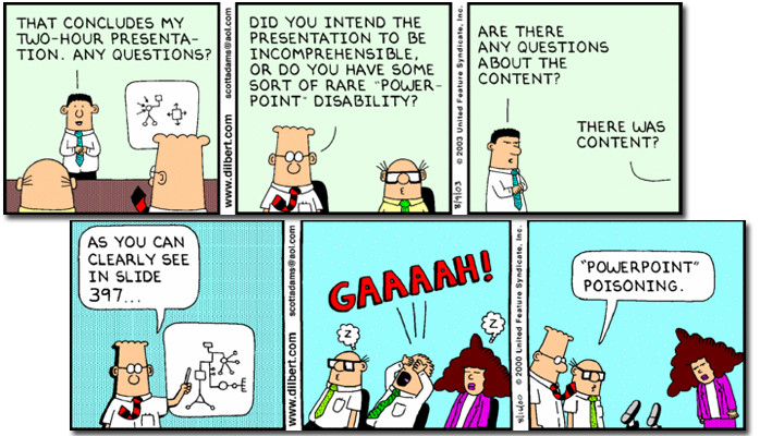
How to Avoid Death by PowerPoint
It’s been 22 years since Microsoft came out with PowerPoint, and today, it seems that some presentations seem to last that long. According to an August 30, 2012 article in Business Week (http://www.businessweek.com/articles/2012-08-30/death-to-powerpoint), an estimated 350 PowerPoint presentations are given each second across the globe.
In sitting through countless presentations over the past 15 years, I’ve determined that are several ways that you can look like a rank amateur when it comes to your next PowerPoint. This has nothing to do with your knowledge of the subject or your level of presentation skills as those are worthy of separate posts.
Here, I'm talking about the presentation itself. Want to have your viewers completely lose interest in your presentation? Want to have your viewers reaching for the Dramamine because of your ‘creative’ use of animations? Then don’t read any further.
I welcome your comments on what tips/tricks you'd add to this.
Top things you can do to make your presentation look like you have the slightest clue what you are doing:
- Stop with the underlining-while you may have been taught that underlining is how you emphasize something back when you had a ‘typing’ class on an IBM Selectric, if you want to emphasize something, bold it or use an accent color (or even both) to make your point.
- And while we’re at it, stop with the 2 spaces after every sentence. Unless you’re using Courier or another mono-spaced typewriter font in your presentation (which you shouldn’t be using in the first place due to poor readability) there is NO need for the two spaces. (Note: you can apply this rule to ALL Word documents too).
- Speaking of fonts, stick to the basics and the right sizes. To gauge the right size, a good rule of thumb is to print out your presentation and place the copies on the floor. Stand over them and read the slides. If you can’t read the slides, it’s likely your audience won’t be able to either. As for the fonts, pick 2 styles of font (one for the header and one for the body and stick with it. Rule 7 can help with that.
- White space is a GOOD thing. Your slides should not be a case of '10 pounds of text and content in your 5 pounds of presentation space'. For more on this, see rule #8.
- PowerPoint is NOT a teleprompter/crutch. As the presenter, you are there to add more to the presentation than what is on the screen. If as a presenter, you read every slide word for word, then either you or the presentation does not need to be there. Use the notes section of the presentation or have hidden slides with additional information for your audience to review later.
- That said, when it comes to sentences, don’t. Have just snippets of your thoughts on the screen. The whole idea of a presentation is that the content and the speaker come together. For effective retention, use bullet points. Short phrases. A snippet of thought. As presenter, your job is to elaborate on the bullets.
- Use a template….any template. Magazine ransom notes aren’t used anymore…why should your PPT look like one? Use a template for consistency (hopefully consistently good, but at least consistent). A template will keep the text in the same place from slide to slide and looking the same throughout the presentation. Here’s a tip: quickly advance through the slides while in the editing mode. Does the first bullet or title dance all over the place between slides? Then you’re doing it wrong.
- The wrong words out of your mouth. If you ever utter the words ‘This slide is pretty busy’, or ‘I know this is too small and you can’t read it’ during any slide of your presentation, then why is it there? Focus on the content you want to highlight using cropping or zooming in. Yes, at times, you’ll need that ‘where in mall are we’ image, but quickly move or zoom to the part you want to focus on. You can also use builds to start slowly with a slide and add content as you go along.
- If the image doesn’t help explain what you’re trying to say, why is it there? Clip art can liven up a presentation, but don’t put a picture there for the sake of having a picture there. And while we’re talking about images, PLEASE learn how to adjust an image size in equal proportion, and also learn how to crop images. If you only need to show part of an image, then only show part of an image.
- Use Shift+Enter and NOT 10,000 spaces to get text where you want it. At some point, you’ll need to edit it and all those spaces become a real pain.
What would you add to this list? There has to be more things folks can do to make their presentations shine. Please share your thoughts.