

The Colour Wheel – Simple Colour fundamentals
Using colour in your design is an important factor in how effective your project is. Understanding and using the Colour Wheel can really help increase that effectiveness.
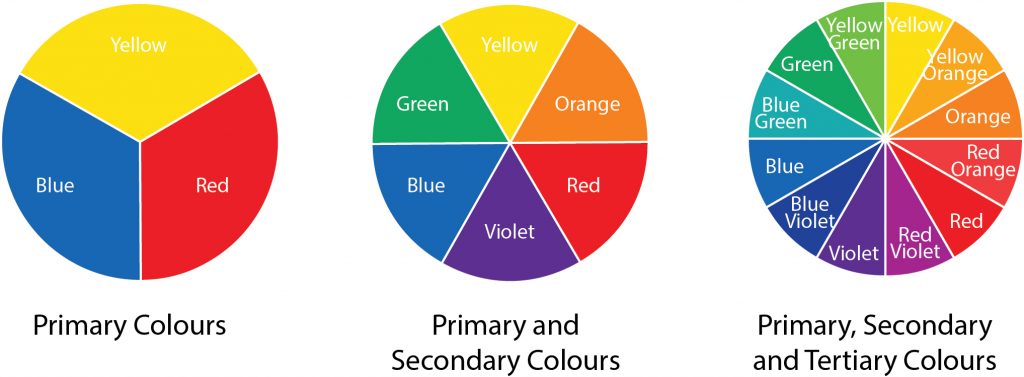
The Colour Wheel
Primary Colours
The first range of colours to understand are the Primary Colours: red, yellow and blue.
Secondary Colours
If you mix the primary colours together, you get more colours:
- red and yellow makes orange
- red and blue makes purple/violet
- yellow and blue makes green
Tertiary Colours
The tertiary colours such as blue green or yellow orange are made by mixing a secondary colour with a primary colour:
- Yellow orange is made by mixing yellow (P) with orange (S)
- Red orange is made by mixing red (P) with orange (S)
- Red violet is made by mixing red (P) with violet (S)
- Blue violet is made by mixing blue (P) with violet (S)
- Blue green is made by mixing blue (P) with green (S)
- Yellow green is made by mixing yellow (P) with green (S)
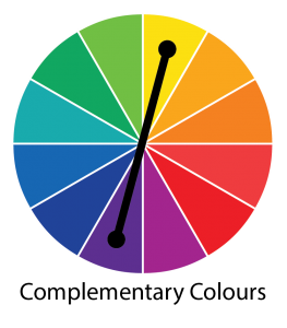
Complementary colours – colour wheel
Complementary colours
Colours that are opposite each other on the Colour Wheel are called complementary colours. This can be used to great effect in design projects to create impact. For example adding a touch of orange as an accent will lift an area of blue, or highlight some text on a page of blue. This will make it stand out.
This technique can also be used with tints, reducing the tint of one colour, then increasing the strength of another one to add emphasis.
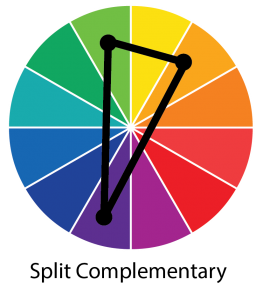
Split complementary colours – colour wheel
Split complementary colours
This colour wheel option uses three colours rather than two. Rather than using the colour directly opposite, it uses the two colours either side of the complementary colour ie if you use violet/purple as the main colour, the two split colours would be yellow green and yellow orange. This gives you a lot more flexibility.
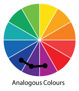
Analogous colours – colour wheel
Analogous colours
The next option to look at is analogous colours – this is made up by three colours next to each other ie blue violet, blue and blue green.
Triadic colours
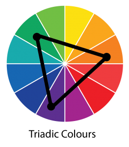
Triadic colours – colour wheel
As it’s name suggests, the triadic colours option uses three colours. These make up an equilateral triangle on the colour wheel – with the colours equal distances apart ie blue violet, yellow green and red orange. Let one colour become the main colour, with the other two acting as support colours.
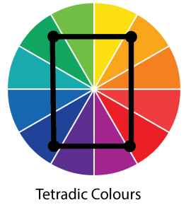
Tetradic colours – colour wheel
Tetradic or double complementary colours
A scheme that is more difficult to use, this option uses four colours on the wheel, two lots of complementary colours.
Tints
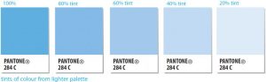
Tints of one colour
Another way os using colour is to use tints of each colour ie if you use a 10% or 20% of say blue, you can use it to highlight a particular piece of text such as bullet points. When using paint, you can achieve a tint by adding white.
In the days before digital printing, when printing more than one colour was very expensive, using tints was a good way of adding colour and interest, whilst keeping the cost down. Now, with digital printing, using tints is still a good way of adding interest, whilst keeping the overall colour of a piece within the same colour range.

Tints and shades
Shades and tones (including monotones)
Whilst tints (making the colour lighter) are achieved by adding white, you can make the colours darker by adding grey or black.
Using one colour throughout a design can be an effective design method, but can also needs care as it can lead to the design looking very flat.
Black and grey

Black and grey tones
As well as being used to change the colour of and darken other colours, black and grey can be used by themselves to add definition and and interest, especially when producing a one colour ad for newsprint/
Warm and cool colours
Another thing to consider when selecting colours is whether they are warm or cool. The warm colours usually site between yellow-green and red, whilst the cooler colours usually site between green and red-violet.
Colours have meaning (something for another blog post) and can convey emotions, as can the warmth of a colour. The warm colours are more vibrant and have more energy. These are good when creating something that is fun and exciting, such as something for younger people or something such as a fair. The cool colours are calmer and more business like, ideal when designing something for a health or financial business.
Colour calculator
Here’s a handy colour calculator to help you select suitable colours.
Learn more about the steps in the design process in our blog post 13 key steps in the design process
Here are some of the benefits for your business when you use good design.
To discuss your design project with us, please call 0775 341 3005 or email info @ iconiccreative.co.uk

As a red-green color deficient individual, this post is incredibly helpful.
Although I can’t see many of the colors described, I love systems that I can work.
Thanks
So glad you found it useful Paul.
Thank you for this post, Nicola!
I always seem not to fully understand colors, lol.
I will sure have to visit this post again.
Very informative.
Glad it was helpful. Drop me a line again if you need any further help