In this module you will learn how to use the Quadrant Chart Custom Visual. The Quadrant Chart is used to show a distribution of data across separate quadrants.
Module 63 – Quadrant Chart
Downloads
- Power BI Custom Visual – Quadrant Chart
- Dataset – NFL Offense.xlsx
- Completed Example – Module 63 – Quadrant Chart.pbix
Key Takeaways
- Shows a distribution of data in separate quadrants.
- Displays up to 3 measures.
This Quadrant Chart displays NFL team stats yards per game, total points, and penalty yards.
- Under the Format paintbrush there are several sections available to modify the appearance of this visual.
- Under the Legend section you can adjust the position and text formatting of the chart legend. You can also turn it off all together.
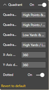
- Under the Quadrant section you have the ability to label each quadrant and change the range of the beginning and end of each quadrant.
- In the X-Axis section you can change the name of the X-Axis label and adjust the formatting of the labels.
In the Y-Axis section you can change the name of the Y-Axis label and adjust the formatting of the labels.
Finally, if you would like the change the color of the bubbles on the chart you can set specific colors to match your needs under the Bubble colors section.
In addition to these properties you have a set of settings that appears on every visual to adjust the background color, add a border around the visual and lock the aspect ratio.
Find Out More
You will always be able to find this video module and advanced viewing of future modules on the Pragmatic Works On Demand Training platform. Click here to learn more about this training platform that includes 30+ courses.
Catch up on all the Power BI Custom Visuals blog posts here.


One comment