The Pareto chart is an invaluable project management tool for visually analyzing problems and prioritizing issues.
This simple bar graph is capable of identifying the vital few sources causing the majority of defects, risks, or delays.
By leveraging the 80/20 rule, you can focus resources on the most impactful 20% of causes to resolve 80% of problems.
In this article, we cover everything that you need to know about Pareto charts including how to construct and interpret them, as well as real-world examples.
Learn how to tap this versatile quality tool to optimize efficiency through data-driven prioritization and help you work smarter, not harder on your next project.
What Is a Pareto Chart?
A Pareto chart is a special type of vertical bar graph used in quality control and analysis.
It visually depicts the most frequently occurring defects, issues, or problems in a process or system.
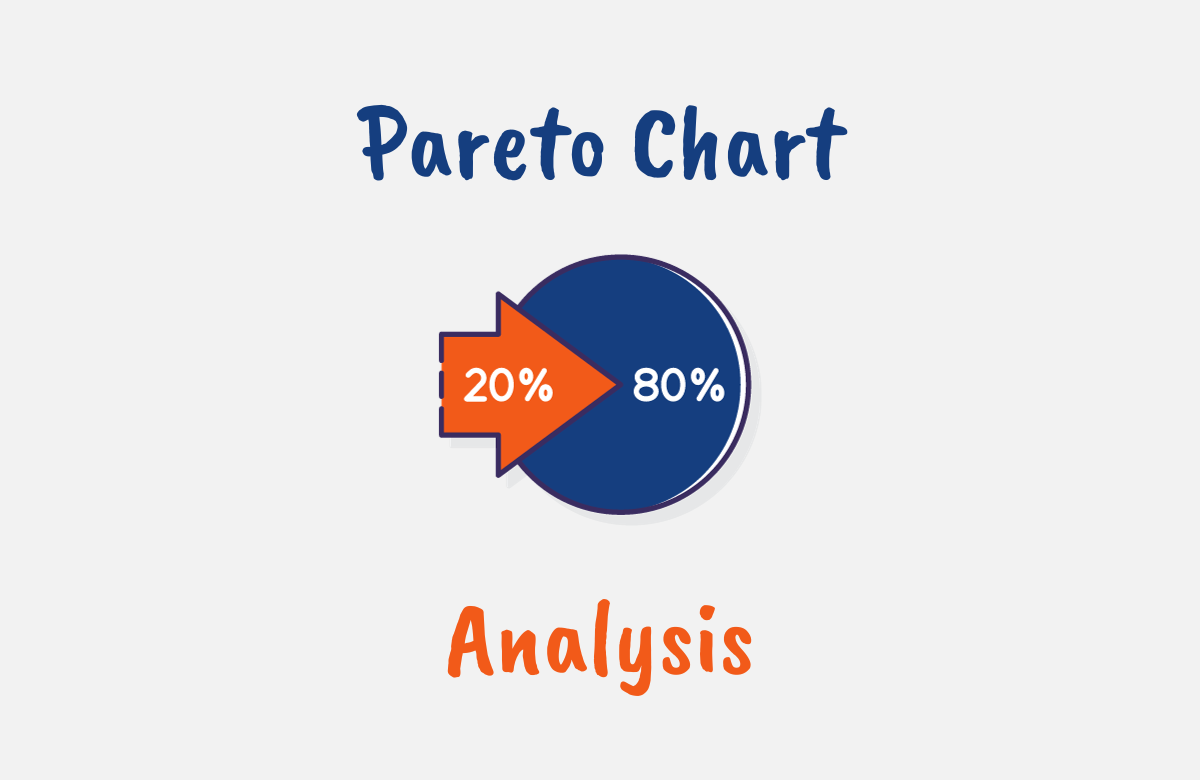
The Pareto chart is named after Vilfredo Pareto, an Italian economist who observed that 80% of a nation’s wealth belonged to only 20% of the population. This became known as the Pareto principle or 80/20 rule.
This principle states that roughly 80% of outcomes come from 20% of causes. The Pareto chart allows you to visually identify those vital 20% of factors leading to 80% of the problems.
On the graph, the bars are arranged in descending order from left to right – tallest to smallest. The height of the bars represents the frequency or count of each issue or defect type.
A cumulative line graph is also plotted, showing the cumulative percentage of issues as you move along the bars from left to right. This line hits 80% at the point separating the critical few issues on the left that make up the majority of the total.
By seeing this vital 20% visually depicted in the Pareto chart, you can focus your quality improvement efforts on those areas for maximum impact. It enables data-driven prioritization and root-cause analysis.
The simplicity and effectiveness of Pareto charts have made them a staple tool for quality control, Six Sigma, project management, and many other fields. Any process or system with quantifiable issues can likely benefit from Pareto analysis.

What is a Pareto chart used for?
The Pareto chart turns abstract data into visual insights helping you communicate priorities to stakeholders, guide data-driven decision-making, and optimize efficiency through selective focus on the critical few factors.
It has a wide range of applications for analyzing data to identify the most impactful issues to prioritize.
Some examples of how Pareto charts are used include:
- Project Management: Pareto chart analysis is used to visualize the key project tasks causing 80% of delays. These vital tasks can then be expedited or re-assigned
- Quality Control: They can be used to identify the top defect types causing product failures. Then quality improvements can be focused on those vital few defects.
- Customer Service: Pareto charts can determine the most common customer complaints so that they are addressed to improve customer satisfaction.
- Sales: They can aid in recognizing the top 20% of customers driving 80% of revenue. Then, sales and marketing can be optimized for those key accounts.
- Manufacturing: Pareto charts can be used to pinpoint operations/processes with the most downtime in order to improve those processes first.
- Human Resources: Pareto analysis can help discover the top 20% of employees responsible for 80% of productivity. These top performers can then be rewarded and retained.
When to use a Pareto Chart in Project Management
As a project manager, you can leverage Pareto charts throughout all phases of the project lifecycle to streamline efforts for maximum productivity.
In planning, you can use Pareto analysis to prioritize risks and identify the 20% of risks causing 80% of potential issues, then focus mitigation on those vital few high risks first.
During execution, utilize Pareto charts to pinpoint the critical path tasks taking the most time. Accelerate those key tasks to shorten the critical path and finish faster.
When problems arise, construct a Pareto graph to visualize the root causes behind 80% of the problems. Fix those few major causes for the biggest impact.
For monitoring and control, employ Pareto analysis to discover the key metrics most affecting project success. Keep those vital few metrics prominently visible on dashboards.
During lessons learned, create Pareto diagrams to uncover what reoccurring issues led to 80% of headaches. Then plan on how to prevent those issues on future projects.
For stakeholders, provide Pareto charts to justify priorities and explain what’s driving most delays or defects. The visuals help gain alignment on the critical few issues requiring focus.
As a communication tool, Pareto charts enable data-driven conversations and decision-making on priorities as their simplicity conveys the essence quickly to diverse audiences.
Injecting Pareto analysis throughout the project lifecycle helps optimize resource usage, improve quality, accelerate schedules, and boost productivity by systematically focusing efforts on the most impactful 20% of activities. The 80/20 rule allows prioritizing the “vital few” over the “trivial many.”
How to Create a Pareto Chart
Creating an effective Pareto chart only takes a few simple steps:
1. Identify the Quality Issues
Begin by clearly defining the specific quality issues, defects, or problems you want to analyze using the Pareto chart. Also, determine the timeframe to include data from such as the past month or quarter.
2. Collect a Robust Dataset
Gather a robust set of data covering the defined issues over the full desired timeframe. The more data points the better for an accurate analysis. Input the raw data into a spreadsheet to categorize and quantify.
3. Create a Frequency Table
Create a frequency table categorizing each issue type and listing the number or count of occurrences for each category.
4. Categorize each Issue Type
Organize the quality issues or defects into logical, distinct categories in the spreadsheet. For example, machine defects may be categorized into types like “electrical”, “mechanical”, “structural”, etc. Assign each data point to one of these categories.
5. Rank the Issues
With the data categorized, rank the issues from highest occurrence to lowest so you know the order to plot them left to right on the chart. Sorting the spreadsheet makes this easy.
6. Label the Bars
As you construct the bars on the chart, be sure to label each bar clearly to define what it represents. Also, include the numeric frequency or count on each bar.
7. Add a Title
Give the Pareto chart a clear, descriptive title conveying the purpose at a glance, like “Machine Defects by Type.”
8. Plot the Cumulative Percentage
Calculate the running percentage total as you add each bar from left to right. Plot this as a line to show the cumulative percentage up to 100% on the right edge.
9. Highlight the 80% Line
Visually emphasize the 80% line on the cumulative percentage plot. This separates the key issues on the left from trivial issues on the right.
10. Add Customer-Focused Axis Labels
Use clear axis labels like “Defect Frequency” or “Defect Count” to help the audience understand the chart. Avoid overly technical labels.
11. Analyze the Chart
Finally, analyze the chart to identify patterns, correlations, and insights to prioritize quality improvements on the vital few categories making up the first 80%.

How to Calculate Pareto Analysis
The steps to calculate a Pareto analysis are:
- Tally the total count or frequency of each defect/issue type.
- Calculate the percentage for each category:
Percentage = Frequency of category / Total frequency of all categories - Sort the categories from highest percentage to lowest.
- Calculate the cumulative percentage for each category moving left to right:
Cumulative % = Running percentage total as you sum each category - Create a Pareto chart with bars arranged from tallest to smallest based on the percentages.
- Plot the cumulative percentage line on the secondary axis.
- Highlight the 80% line on the cumulative percentage plot.
- Analyze the left categories above the 80% line as the “vital few” priorities requiring focus.
- Consider grouping smaller low-impact categories on the right for simplicity.
With each category’s percentage share, rank, and cumulative total, you can assemble and interpret the Pareto chart to identify the most impactful “vital few” categories for your quality improvement efforts.
While calculating the Pareto analysis is generally straightforward, the harder work is gathering accurate defect data and translating the insights into meaningful process changes.
How to interpret Pareto Charts
Interpreting Pareto charts enables data-driven decision-making by revealing the “vital few” issues to prioritize. Here are tips for analyzing Pareto charts:
- Focus on the bars to the left of the 80% cumulative percentage line. This zone contains the most frequent/costly defect types requiring the most attention.
- Consider grouping and combining smaller categories on the right that make up the “trivial many” to simplify the chart.
- Identify patterns or trends in the data. For example, a defect type that has grown over recent months warrants investigation.
- Watch for outliers – unusually tall bars on the left skewing the chart. Consider whether these warrant their own separate analysis.
- Review the choice of metrics on the axes. For example, switching from frequency to cost impact may change perspectives.
- Compare multiple Pareto charts to spot common issues across locations, products, time periods, etc.
- Leverage other tools like fishbone diagrams to uncover the root causes behind the most frequent defect types.
- Brainstorm ways to predict and prevent the top defect types depicted. This sparks continuous improvement ideas.
- Communicate insights from the chart to influence stakeholders on priorities requiring focus and resources.
- Periodically refresh Pareto analyses to detect new patterns and progress made on past issues.

Advantages and Disadvantages of Pareto Charts
Advantages of Pareto charts include:
- They provide data-driven visualization of the most frequent or costly quality issues.
- Pareto charts enable smarter resource allocation focused on the “vital few” problems.
- Their simple graphical format is highly accessible even for non-technical audiences.
- They reveal priorities and performance insights at a glance.
- They are useful for both retrospective analysis and proactive prevention.
- It is easy to brainstorm improvements based on the patterns shown.
- They compare issue types and trends across products, processes, and time periods.
- Using Pareto charts lets you benchmark issue types against industry metrics.
- They are simple to construct charts in any spreadsheet program.
- They are adaptable to almost any quantifiable issue an organization faces.
- They foster a culture of continuous improvement based on facts.
Some disadvantages of Pareto charts are:
- Pareto charts depend heavily on the categorization of issues, which can be open to bias.
- Counterintuitive results may emerge from the purely data-driven approach.
- It shows frequency but not severity – obscures infrequent but serious defects.
- Data collection and analysis require diligent management.
- The Pareto principle is not a universal law and results don’t always follow 80/20.
- The correlation shown does not prove causation of issues and solutions.
- They provide a rearview mirror perspective by focusing on past data.
- It can be difficult to accommodate contextual factors.
- Actioning the insights requires additional change management efforts.
- It triggers a tendency to overload high-occurrence categories with resources.
Overall, the many pros tend to outweigh the cons for most quality improvement initiatives. Used thoughtfully, Pareto analysis delivers tremendous efficiency gains.
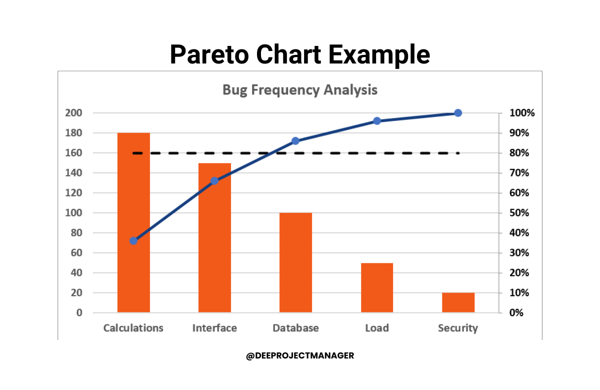
Pareto Chart Example
Let’s walk through an example scenario to illustrate a Pareto analysis in action.
A Software Company tracks the types of customer-reported software bugs over the past quarter to prioritize debugging efforts. They categorize the bugs into Database, Interface, Calculations, Load, and Security based on 500 reported issues.
The team creates a Pareto chart with the bug types on the X-axis and the frequency on the Y-axis. The chart visually depicts Calculations bugs as the most frequent at 180, followed by Interface at 150, Database at 100, Load at 50, and Security at 20.
The cumulative percentage line shows the first three categories account for over 80% of total bugs.
This Pareto analysis clearly displays that fixing Calculations, Interface, and Database bugs should be the development team’s priority. It enables them to focus testing and debugging time on the vital few issue types with the biggest customer impact.
This example demonstrates how a simple Pareto chart can transform abstract bug data into visually actionable priorities.
The development team can now work smarter by concentrating efforts on the 20% of bug types causing 80% of quality issues.

Pareto Chart PMP Exam Tips
Pareto charts are a vital tool in Project Quality Management for the “Plan Quality” and “Control Quality” PMBOK guide project management processes.
For the Plan Quality process, Pareto diagrams are used to identify and document potential problems.
ln Control Quality, you measure the data and represent it on the diagram to help analyze the situation and determine where to focus corrective action.
Mastering the use of Pareto Charts will bolster your ability to handle PMP exam questions associated with quality management and problem prioritization.
For Pareto chart PMP exam tips, note the following:
- Process Identification: Recognize that Pareto Charts are primarily used in “Plan Quality” and “Control Quality” processes. Understanding the context of use will help answer related questions.
- Interpretation: Learn how to interpret Pareto Charts. They rank issues by frequency or severity, which aids in focusing on critical problems that require immediate attention.
- Cumulative Percentage: Pay attention to the cumulative percentage line in a Pareto Chart. It helps identify the smallest number of causes that result in the largest effects.
- Problem-Solving: Remember that Pareto Charts are used for prioritizing and solving problems. They help identify the ‘vital few’ from the ‘trivial many’.
- Limitations: Be aware of the limitations. Pareto Charts are excellent for showcasing clear priorities, but they don’t reveal relationships between causes or provide statistical proof.
Conclusion
The versatile Pareto chart simplifies data analysis to boost efficiency. By leveraging the 80/20 rule to isolate the vital few factors driving the majority of outcomes, you gain powerful insights to optimize resource allocation.
Focusing efforts on the biggest quality issues delivers an outsized impact. With clear visualization and easy interpretability, Pareto analysis brings data to life across departments and injects a smarter, data-driven approach into organizational decision-making and process improvement initiatives.