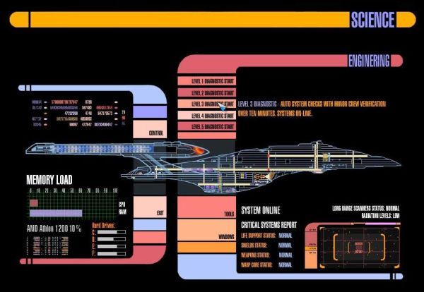
The main touch based user interface on Star Trek (TNG) was of course LCARS, or Library Computer Access/Retrieval System. I guess at the time it was “developed”, the usability of this system may not have been critical. The UI consists of a black background which uses a condensed sans serif typeface, reputed to be Swiss 911 Ultra Compressed. It makes extensive use of background “frame” graphics with rounded corners in a myriad of pastel tones of purples, blues and oranges. Text is similarly shown as either black text on a coloured background, or coloured text on the black background. Within this structure are placed buttons, labels, and diagrams.

First the font. It is supposedly Swiss 911 Ultra Compressed. There is nothing inherently wrong with the font… however the use of UPPERCASE (caps) letters everywhere in the interface may make it more challenging to quickly decipher information. The problem with caps is that it has the effect of de-emphasizing the information on the screen, because text in all caps reduces the shape contrast of each word. The shape of a word in caps, regardless of the type of font, is a rectangle (with parallel edges top and bottom) – this implies a low shape contrast. The more non-parallel edges a word has the higher the shape contrast. Bottom line is that no one should force a user to read words with bad shape contrast. In this respect, LCARS is similar to a webpage written using all caps. Part of the difficulty in reading caps may lie with the learned behaviour of reading mixed-text.
Some believe the use of mixed case has more to do with the idea of parallel letter recognition. This model says that the letters within a word are recognized simultaneously, and the letter information is used to recognize the words [1].
The art of reading is likely a much more complex entity than we understand, one that is individualized. Most likely it occurs as a process. Maybe we recognize words first by their shape. Words that we know can be recognized by memory or context – if this is the case we “read” the word and move on. Otherwise, we may assemble the letters into words by using context and experience. Finally, failing those two approaches, the word is read in a serialized manner, which is common for more complex or unfamiliar words.
Next, the colour. I get that the use of so many colours can make the interface look cool, but it can also be distracting. First, let’s deal with the black background. Dark designs like this have a tendency to make the UI feel “heavy”. The core reason is readability. Most people don’t like viewing light text against a dark background because it causes eye strain. This design may have evolved from the use monochrome monitors from the 1960s through the 1980s – black screen punctuated by green, amber, or white characters.
Then there is the colour of the text itself. There seem to be too many colours being used. Too many colours can make the UI seem cluttered as well. LCARS would have worked better if the colours had been more muted. If an alert occurs, how is it highlighted in such a complex UI?
[1] Larson, K., The Science of Word Recognition
Engineering is misspelled in the GUI image.
P.S. I didn’t make the image.