- Power BI forums
- Updates
- News & Announcements
- Get Help with Power BI
- Desktop
- Service
- Report Server
- Power Query
- Mobile Apps
- Developer
- DAX Commands and Tips
- Custom Visuals Development Discussion
- Health and Life Sciences
- Power BI Spanish forums
- Translated Spanish Desktop
- Power Platform Integration - Better Together!
- Power Platform Integrations (Read-only)
- Power Platform and Dynamics 365 Integrations (Read-only)
- Training and Consulting
- Instructor Led Training
- Dashboard in a Day for Women, by Women
- Galleries
- Community Connections & How-To Videos
- COVID-19 Data Stories Gallery
- Themes Gallery
- Data Stories Gallery
- R Script Showcase
- Webinars and Video Gallery
- Quick Measures Gallery
- 2021 MSBizAppsSummit Gallery
- 2020 MSBizAppsSummit Gallery
- 2019 MSBizAppsSummit Gallery
- Events
- Ideas
- Custom Visuals Ideas
- Issues
- Issues
- Events
- Upcoming Events
- Community Blog
- Power BI Community Blog
- Custom Visuals Community Blog
- Community Support
- Community Accounts & Registration
- Using the Community
- Community Feedback
Register now to learn Fabric in free live sessions led by the best Microsoft experts. From Apr 16 to May 9, in English and Spanish.
- Power BI forums
- Forums
- Get Help with Power BI
- Desktop
- Quadrant chart with predetermined quadrants
- Subscribe to RSS Feed
- Mark Topic as New
- Mark Topic as Read
- Float this Topic for Current User
- Bookmark
- Subscribe
- Printer Friendly Page
- Mark as New
- Bookmark
- Subscribe
- Mute
- Subscribe to RSS Feed
- Permalink
- Report Inappropriate Content
Quadrant chart with predetermined quadrants
Hi All,
I have a long list of attribute each having an assigned quadrant of 1-4 using predefined rules. Is there a way I can plot them so they appear on the quadrant chart (by MAC) without having to put the anything for x or y axis?
Solved! Go to Solution.
- Mark as New
- Bookmark
- Subscribe
- Mute
- Subscribe to RSS Feed
- Permalink
- Report Inappropriate Content
Hi @goalie_ ,
Create 2 measures similarly as below:
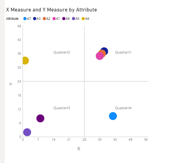
X Measure = IF(MAX('Table'[Attribute]) in {"A1","A2","A3","A7"},SUM('Table'[Value])+SUMX(ALL('Table'),'Table'[Value]),MAX('Table'[Value]))Y Measure = IF(MAX('Table'[Attribute]) in {"A1","A2","A3","A4"},SUM('Table'[Value])+SUMX(ALL('Table'),'Table'[Value]),MAX('Table'[Value]))And you will see:
All of the attributes have been plotted in the predetermined quadrants.
For the related .pbix file,pls see attached.
Kelly
- Mark as New
- Bookmark
- Subscribe
- Mute
- Subscribe to RSS Feed
- Permalink
- Report Inappropriate Content
@amitchandak @v-kelly-msft for example if I have data as below
| Attribute | Quadrant |
| A1 | 1 |
| A2 | 1 |
| A3 | 1 |
| A4 | 2 |
| A5 | 3 |
| A6 | 3 |
| A7 | 4 |
Can I plot the attributes(randomly) within that quadrant? Or should I be looking at a different visual
- Mark as New
- Bookmark
- Subscribe
- Mute
- Subscribe to RSS Feed
- Permalink
- Report Inappropriate Content
Hi @goalie_ ,
Create 2 measures similarly as below:
X Measure = IF(MAX('Table'[Attribute]) in {"A1","A2","A3","A7"},SUM('Table'[Value])+SUMX(ALL('Table'),'Table'[Value]),MAX('Table'[Value]))Y Measure = IF(MAX('Table'[Attribute]) in {"A1","A2","A3","A4"},SUM('Table'[Value])+SUMX(ALL('Table'),'Table'[Value]),MAX('Table'[Value]))And you will see:
All of the attributes have been plotted in the predetermined quadrants.
For the related .pbix file,pls see attached.
Kelly
- Mark as New
- Bookmark
- Subscribe
- Mute
- Subscribe to RSS Feed
- Permalink
- Report Inappropriate Content
thanks kelly. I also have another column for the attributes where I have them in category 1, 2, and 3. I want to plot the individual points but have them be the same color if they're in the same category. Multiple attributes can fall within a category.
So A1, A2, and A4 can fall into category 1;
A3, A5, A7 fall into category 2
A6 is in category 3.
However the visual takes the aggregate of the ones that fall in the same category. Is there a way to use the legend axis field so it doesn't take the aggregate of the attributes that fall into the category?
- Mark as New
- Bookmark
- Subscribe
- Mute
- Subscribe to RSS Feed
- Permalink
- Report Inappropriate Content
@goalie_ , not very clear. I tried something with scatter
https://youtu.be/Q1vPWmfI25o?t=2847
Microsoft Power BI Learning Resources, 2023 !!
Learn Power BI - Full Course with Dec-2022, with Window, Index, Offset, 100+ Topics !!
Did I answer your question? Mark my post as a solution! Appreciate your Kudos !! Proud to be a Super User! !!
- Mark as New
- Bookmark
- Subscribe
- Mute
- Subscribe to RSS Feed
- Permalink
- Report Inappropriate Content
Hi @goalie_ ,
Do you mean "Quadrant Chart by MAQ Software"?
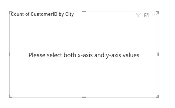
Based on my test,without x and y axis value,it is not available to create the quadrant chart,and it will return an error as below:
Could you show me some sample data with expected output?I would suggest you create a calculated column to make the quadrant showing as predetermined.
Best Regards,
Kelly
Helpful resources

Microsoft Fabric Learn Together
Covering the world! 9:00-10:30 AM Sydney, 4:00-5:30 PM CET (Paris/Berlin), 7:00-8:30 PM Mexico City

Power BI Monthly Update - April 2024
Check out the April 2024 Power BI update to learn about new features.

| User | Count |
|---|---|
| 98 | |
| 97 | |
| 81 | |
| 77 | |
| 66 |
| User | Count |
|---|---|
| 126 | |
| 105 | |
| 103 | |
| 81 | |
| 72 |


