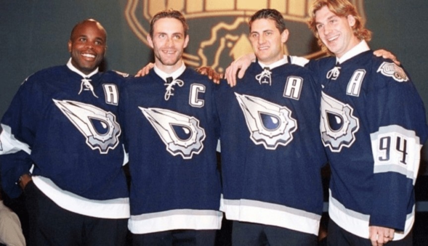
The Edmonton Oilers always seem to get cold feet when it comes to exploring the brave new world of hockey jerseys, though when you knock your first jerseys out of the park, it’s hard to deviate from what works. It’s the reason the organization has revisited their original blue jerseys twice in their history.
Number 10: Reverse Retro (2021)
The Oilers are one of the few teams that seemingly stuck by the theme of “reverse retro” as this is just an inversion of their original home jerseys from the 1980’s, but boy do they not look flattering at all. This jersey paired with solid orange pants it’s just too much. Points for sticking to the stip of the gimmick, but they’re just too ugly to appreciate.

Number 9: Reebok Edge Away (2007-2011)
Look no further than Edmonton to see the full effects of Reebok’s 2007 takeover. The horizontal piping on the front of the jersey with the half-stripe on the sleeve were two trademarks Reebok snuck onto as many jerseys as possible during their heyday. It’s not a terrible look, but just very cookie-cutter bland.

Number 8: Reebok Edge Home/Alternate (2007-2012)
Reebok kept the navy blue and bronze colors from their previous kits but plastered them on the bland jersey setup. This color scheme is still awesome, but Reebok really dumbed down the potential with their “innovative” design.

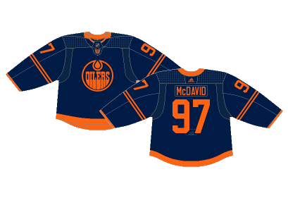
Number 7: Current Alternate (2019-Present)
Monochromatic jerseys have made appearances across the NHL lately, most notably the Dallas Stars alternate, but the Oilers joined the party with their solid navy blue jerseys with minimal orange and no white to speak of. It’s a classic example of big braining something and it just doesn’t work.
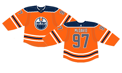
Number 6: Current Home (2017-2021)
Following the path of the Anaheim Ducks, the Oilers opted to take their orange complementary color and make it a full-time jersey, but unlike the Ducks, these are their home jerseys rather than their alternates. An inversion of their previous blue home jerseys seems like the biggest change they can make without actually re-designing their setup. They’re not terrible, and will more than likely define the McDavid era of Oilers hockey, but straying from the classic blue unis is never a good idea.
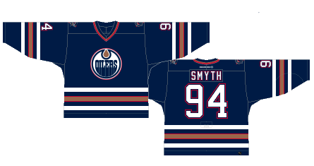
Number 5: Midnight Blue Home (1997-2001)
The basis of these jerseys are the most basic design out there. The simple five stripes on the elbows and tail paired with this color scheme just works. The bronze is a unique color to apply to a hockey jersey, but it works well with the midnight blue. It’s visually pleasing to look at and is a very different look than their original blue and orange jerseys.
Number 4: Oil Drip (2001-2007)
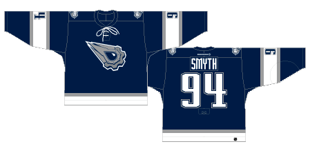
When you think about some of the more notable alternate jerseys in NHL history, the Oilers “Oil Drip” jersey definitely comes to mind. The logo was designed by comic book creator Todd McFarlane. The slightly different shade of blue with grey and white accents make for a sleek jersey and the iconic crest and wacky font on the nameplates tie the whole thing together.
Number 3: Midnight Blue Away (1996-2007)
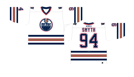
The midnight blue era of Oilers jerseys was awesome, but the away whites where the dark blue and bronze were utilized as supporting colors rather than the base is so much more appealing. Sometimes simple is better when it comes to hockey jersey design.
Number 2: Original Away (1979-1996) (20011-Present)
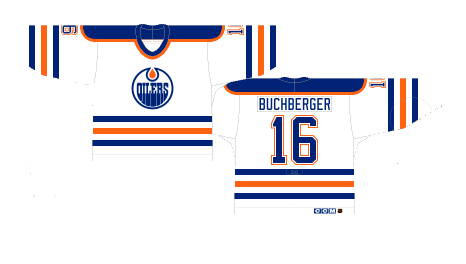
When you do a jersey right the first time, you really shouldn’t ever change them. The Oilers reverted to their original design and color scheme over a decade after opting for their midnight blue look. Even though the current away jerseys feature slightly darker oranges and blues, the tried and true design still runs deep in Edmonton.
Number 1: Original Home (1979-1996) (2008-2017)
One of the most iconic hockey jerseys in NHL history, the vintage blue Oilers jerseys represent an era of Wayne Gretzky’s reign over the league. You can’t see this jersey and not think “Wayne Gretzky.”

By: Dan Esche (@DanTheFlyeraFan)
photo credit: nhluniforms.com / beerleagueheros.com

