Ctrl+alt+del is an infamous webcomic by Tim Buckley.
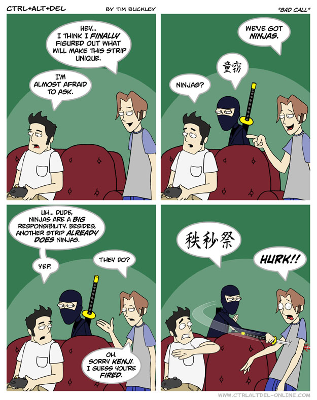
WRITING: It starts out following the standard gamer-culture comedy webcomic formula that is a dime a dozen. The jokes are flat and become dated quickly, as videogames as a medium evolve relatively quickly. An interesting criticism of this specific series is the “wall of text” that many former readers complain about. An exmaple:
 (
(This is a big issue, as the jokes take too long to get to a punchline, and when they finally do, it doesn’t deliver. This leads to the infamous arcs of the comic, where Buckley attempts to introduce serious drama into his little gag comic. The worst of these is the infamous Loss arc. This is already the subject of a lot of reviews, so I’ll get any unfamiliar readers up to speed. It’s heavy handed, it comes out of nowhere, it’s offensive, and it is not entertaining.
ART: The art has 3 distinct stages throughout the comics life. Early stage, mid stage, and current. The early stage looks a lot rougher than mid stage, but at least features a little more variety in faces than the mid stage. However, the issue of boring visual composition and copy-and-pasted characters will plague the comic from this point all the way until current era.
 Along with the watermark on the page itself here’s a link)
The middle phase of the comic is what most people are familiar with. It features the rise of plain backgrounds and copy-and-pasted characters.This is the worst of the three phases, as embodied by the rise of the infamous “B^U face” meme (which references the lack of facial expressions at this time). A good example of this is the borrowed gif below, courtesy of The Bad Webcomics wiki:
 (gif borrowed from The Bad Webcomics wiki)
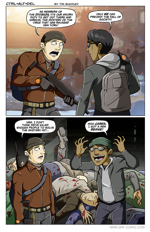
Finally we reach the current phase, which has more work put into it, but its still not anything worth writing home about. At least there is more play with perspective now, but the artists facial expressions are still not exaggerated enough. A mediocre style for mediocre comedy.
 (Again, along with the watermark, a link)
FORMAT: The site actually has a pretty good format. Check out the homepage. The only issue with it I have that is a huge pet peeve of mine is:
NO LINK TO AN ARCHIVE ON THE HOMEPAGE
This angers me beyond belief every time I see it. However, there is easy access to pretty much everything else with eye-catching, quick to digest visuals. You can also get to the archive from any of the comic posts. So overall, the site format is solid.
OTHER: I cannot stress enough how mediocre everything feels with this webcomic. The jokes, art, wall of texts, and attempts at serious writing fall so flat every time. It comes out mediocre and quickly rots as the games it jokes about fall out of focus quickly, as is the nature of the industry. It starts out flat, and the art improves, but still only reaches a level of a beginner level artist. There are much better webcomics out there to read, DO NOT WASTE YOUR TIME ON THIS ONE.

Interesting Critique on the comic. I like how you give a detailed view of the progression of the art, and point out that even with upgraded aesthetics, the writing is still bland. Thank you for the review
LikeLike